Brand identity · Ride-hailing
Putting the power back in the drivers’ hands.
A genuine driver-owned co-operative, built from the ground up, taking on the overseas giants of the Irish ride-hailing market.
- Client
- Tap a Taxi
- Sector
- Ride-hailing
- Scope
- Logo design · Brand identity
- Structure
- Driver-owned co-operative
- Drivers
- 3,000+ signed up
The Challenge
For too long, the Irish ride-hailing market has been dictated by overseas giants. A massive chunk of every fare earned by local drivers is siphoned off to corporate headquarters abroad, leaving the drivers themselves with no say in the rates, the mounting fees, or how the apps actually work.
A group of taxi drivers looked at this broken system and decided it wasn’t right. They didn’t set out to be the biggest or the flashiest tech firm; they just had a simple, revolutionary idea: what if we owned the app ourselves?
The Client
Enter Tap a Taxi. Built from the ground up, it is a genuine driver-owned co-operative. Every driver who joins isn’t just a number on a screen; they are a co-op member with a tangible stake in the business and a real vote on how it’s run.
Building something that has to take on the incumbents?
The Design Solution
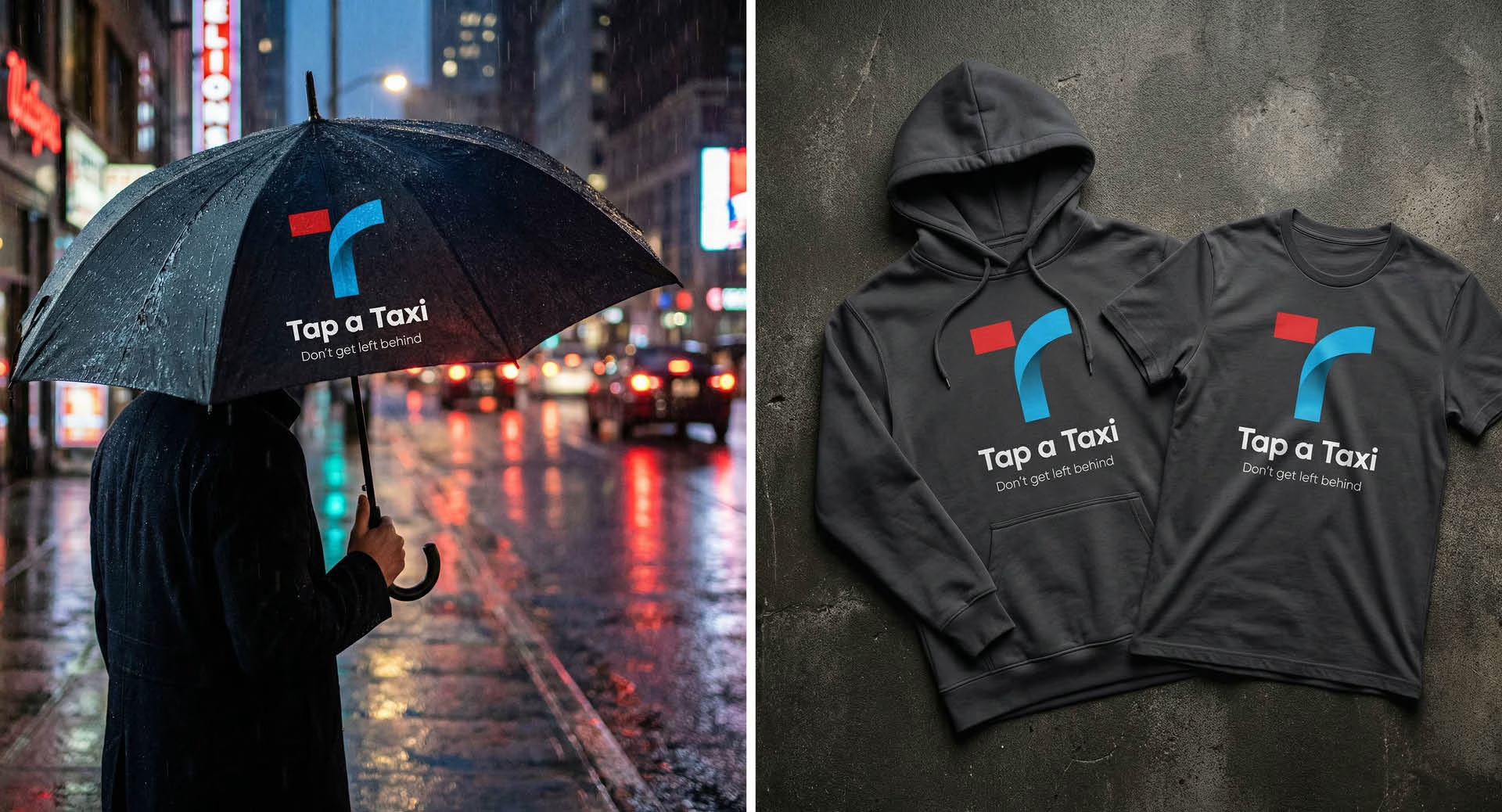
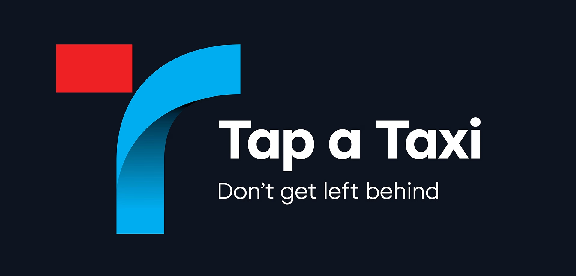
When Tap a Taxi approached us at Design Minds to create their logo, we knew this was far more than just another tech startup. We needed to encapsulate their grassroots, challenger spirit into a single, powerful brand mark.
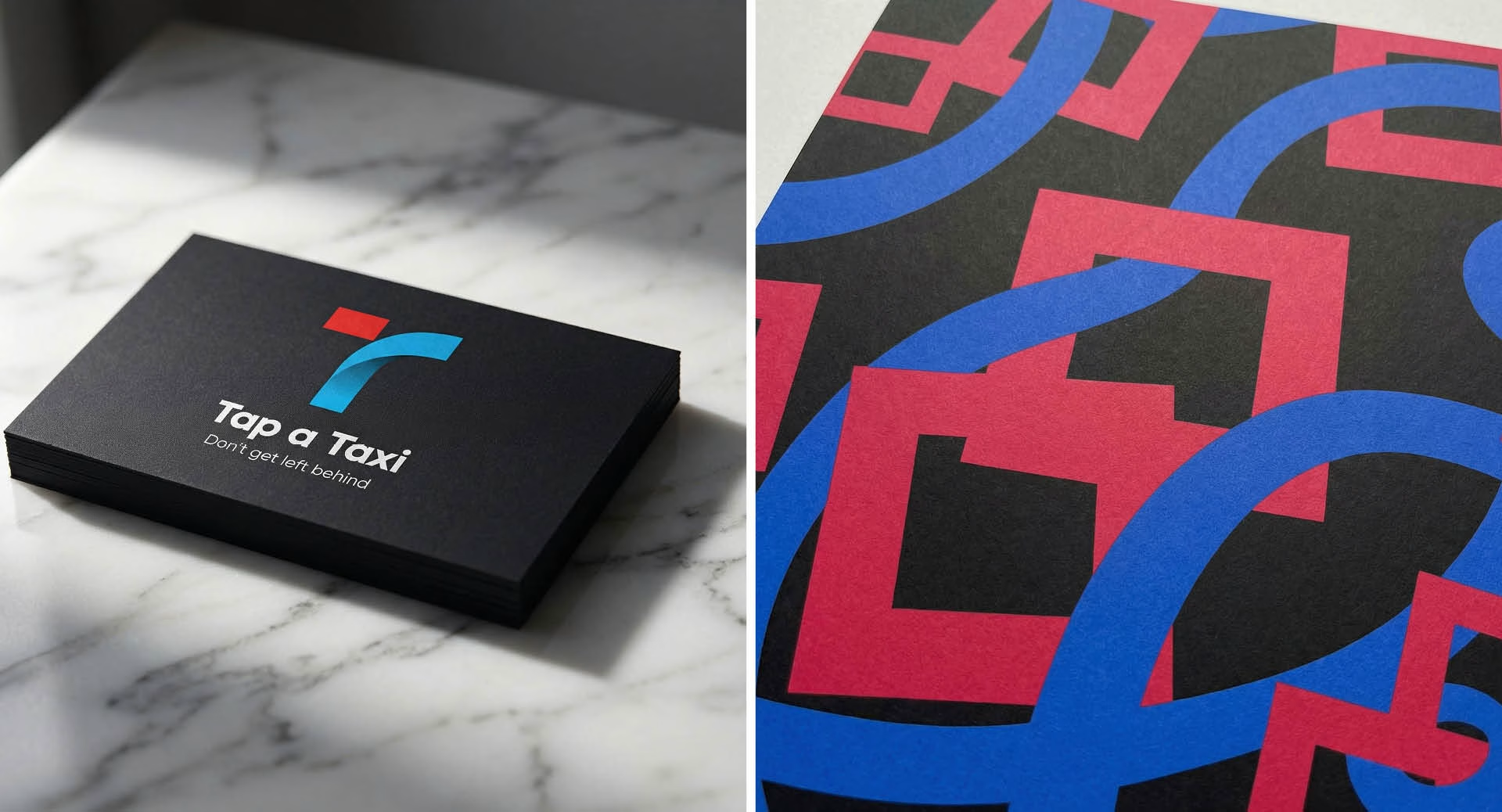
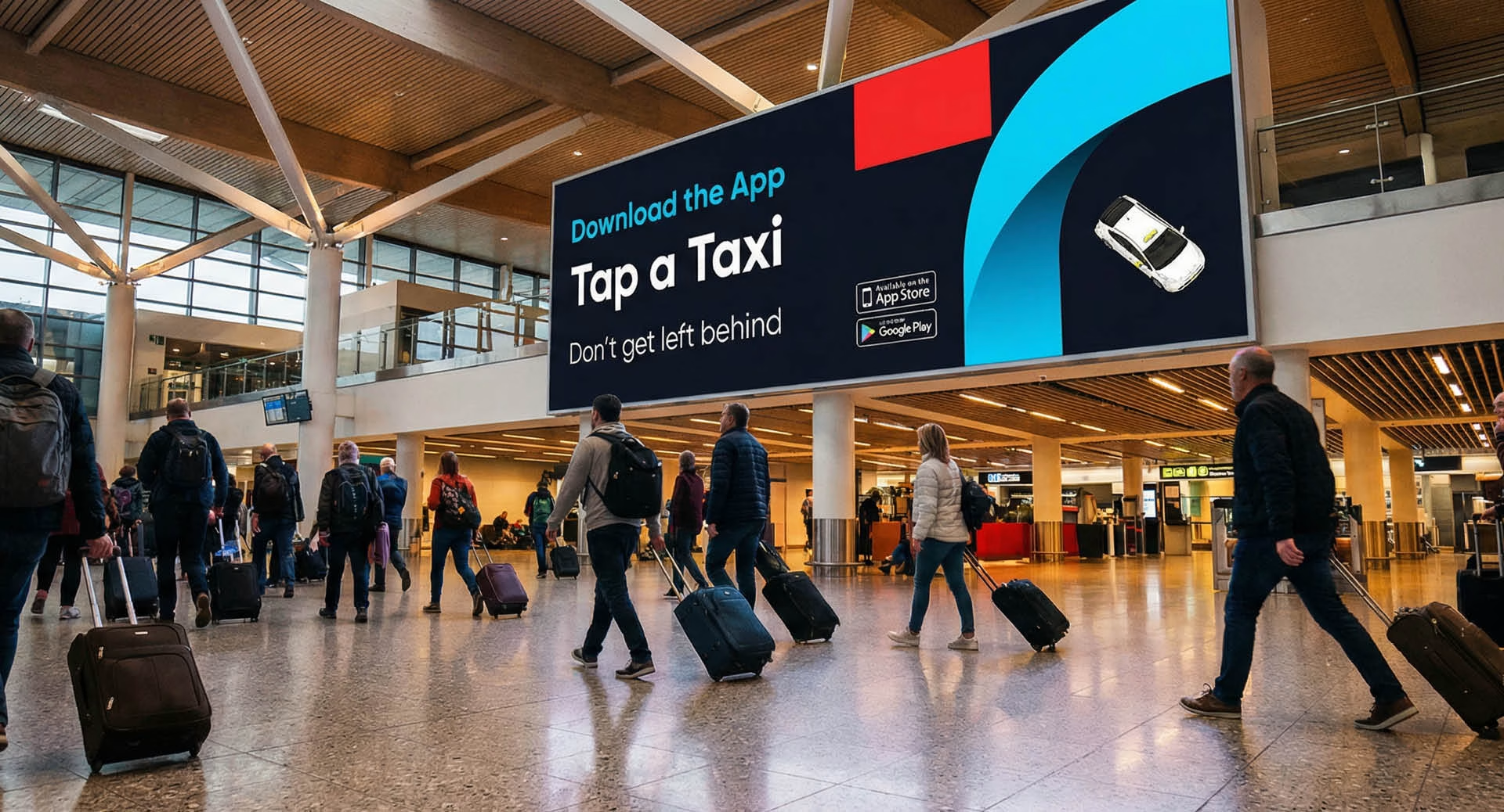
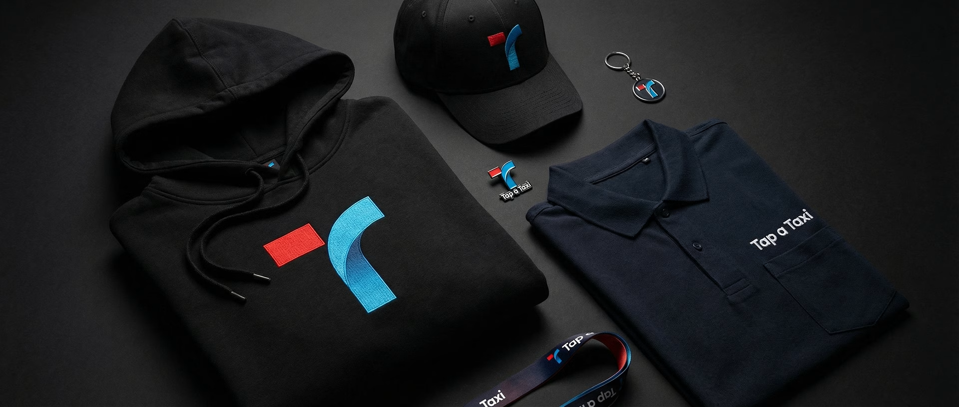
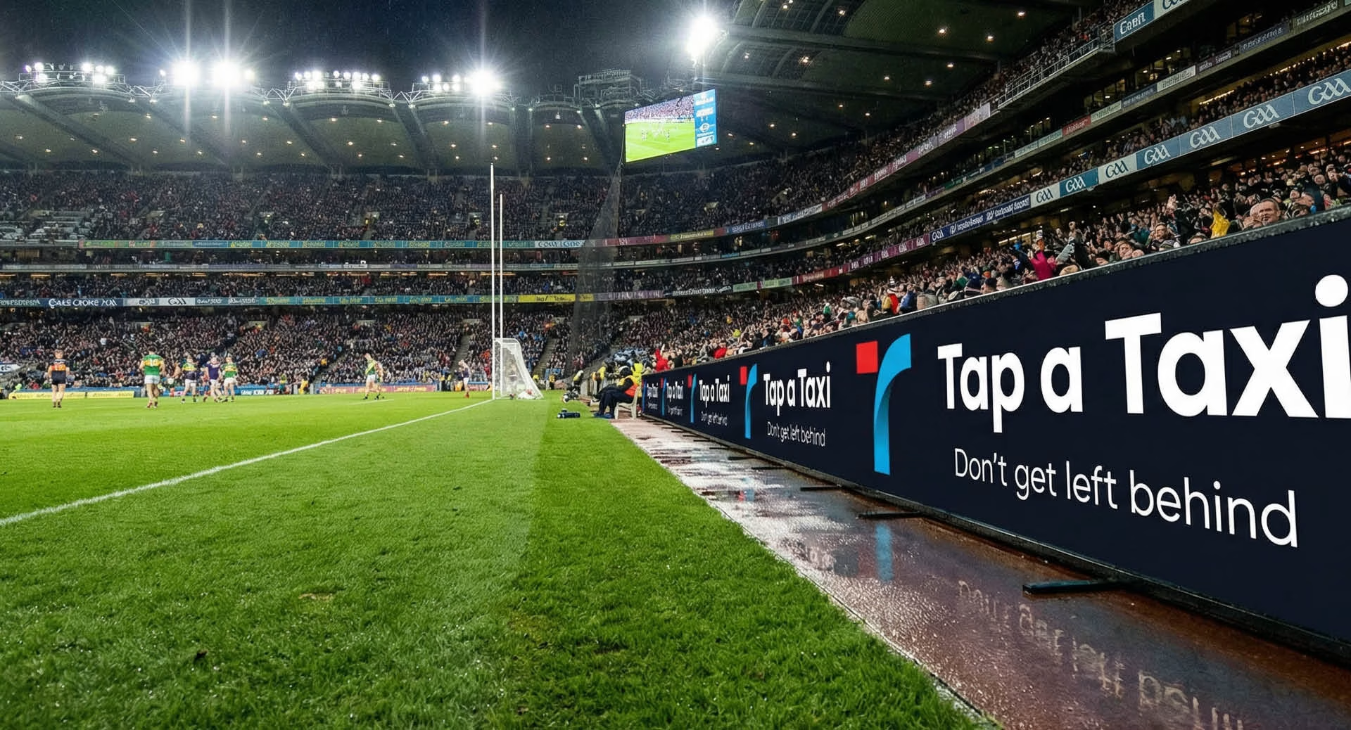
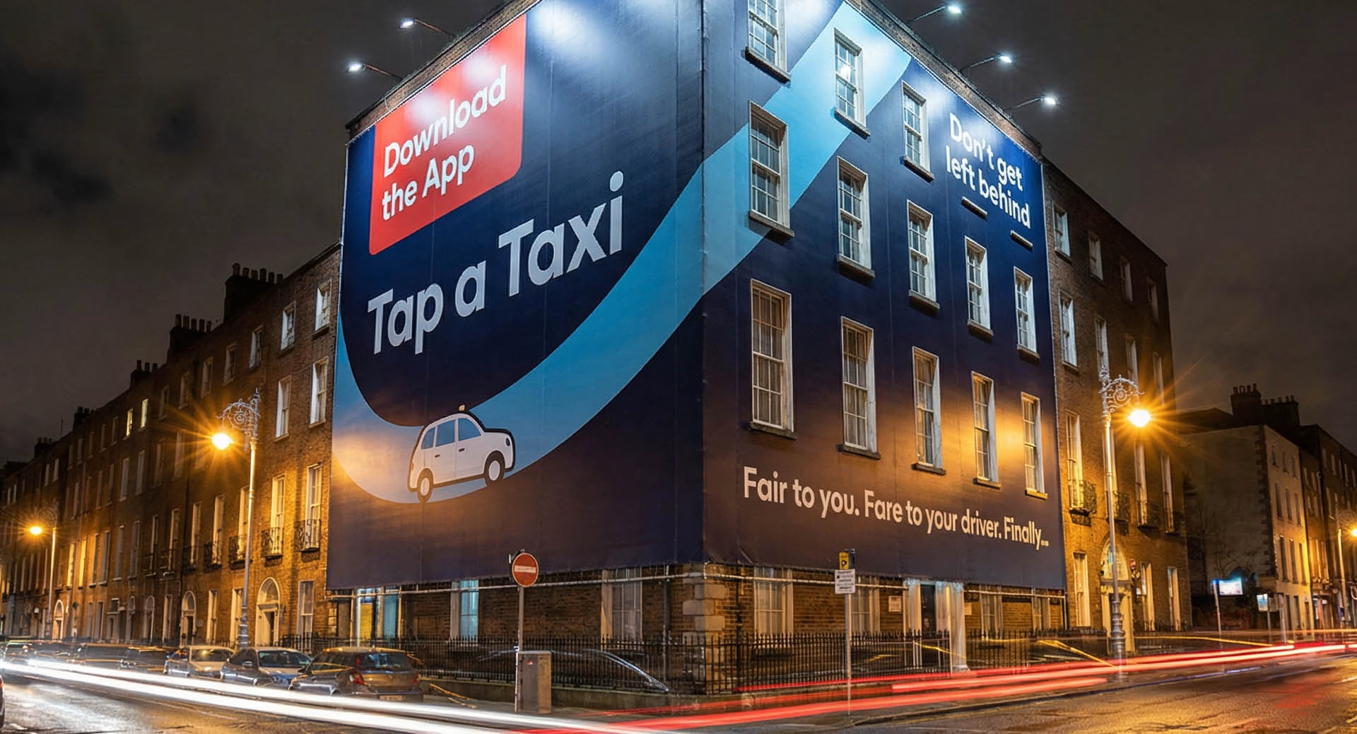
The logo we designed reflects their core ethos: community, fairness, and a no-nonsense approach to getting the job done. We stripped away the corporate gloss favoured by the overseas monopolies to create an identity that feels honest, hardworking, and distinctly theirs.
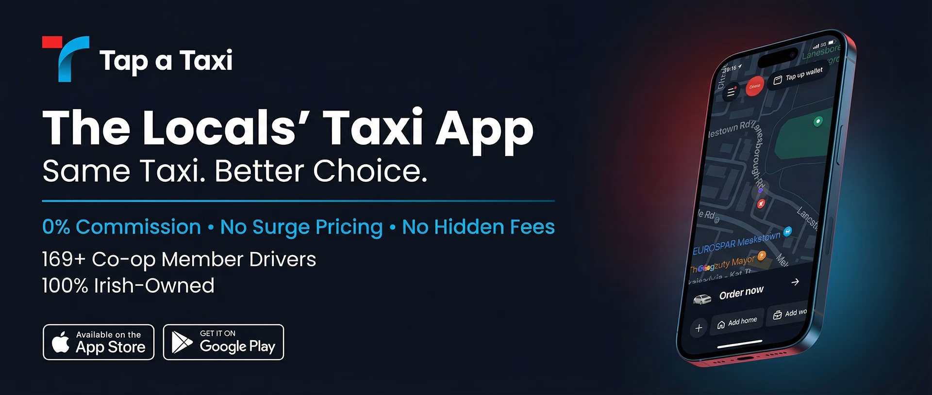
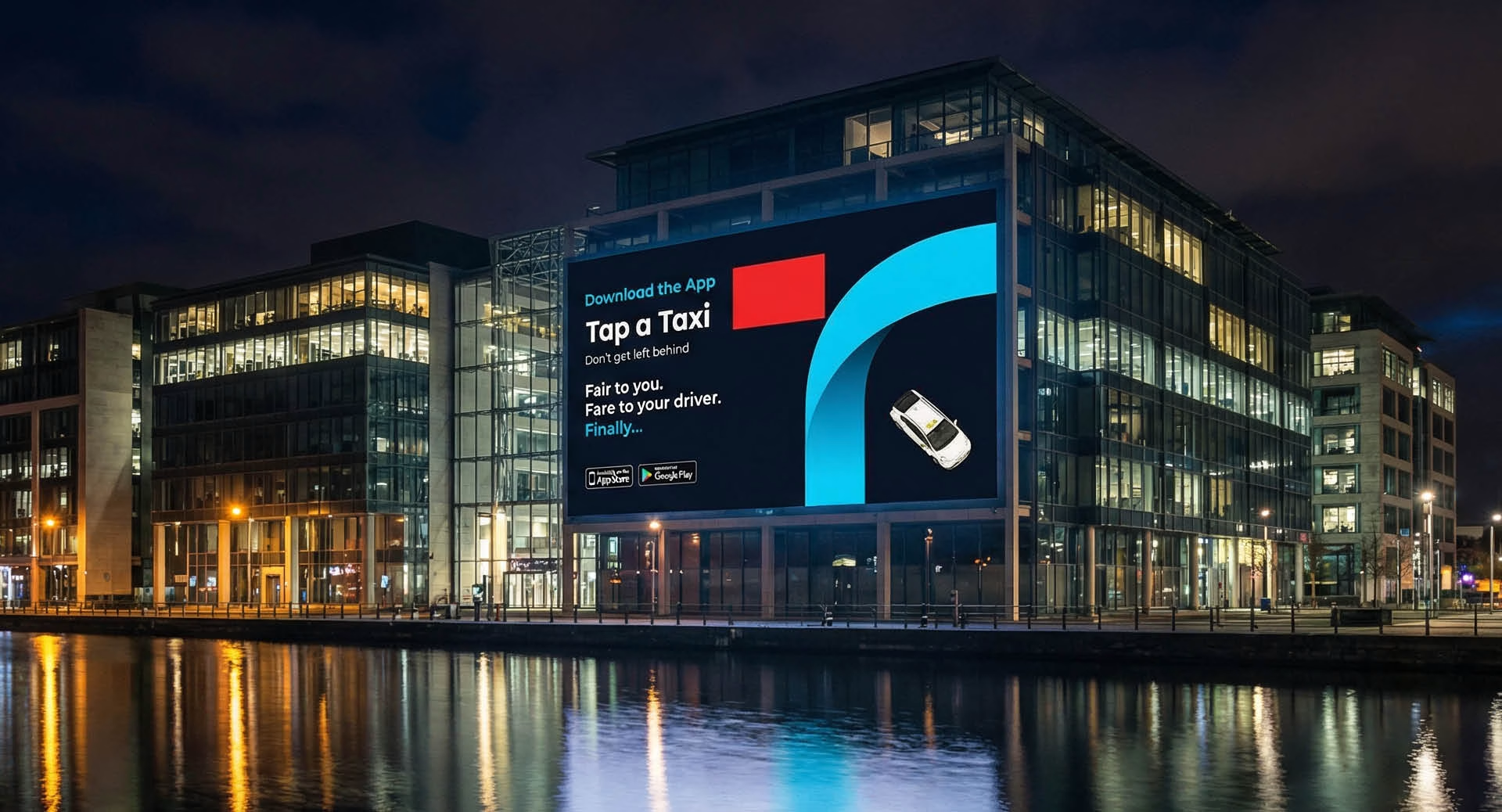
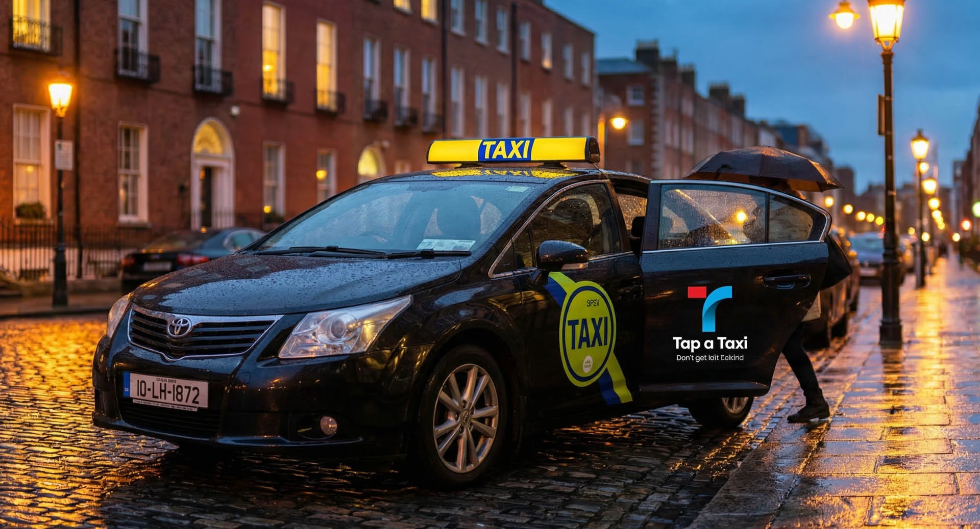
It’s designed to look just as good on the side of a cab as it does on a smartphone screen.
The Result
We delivered a visual identity that stands out in a sea of corporate tech clones. It’s a brand built for the people behind the wheel.
More than 3,000 taxis have signed up to the co-operative since launch.
At Design Minds, we are incredibly proud to have partnered with Tap a Taxi to help them take on the giants. It’s a modern-day David and Goliath story, and we made sure David has a strong logo.
“Sure, we don’t know if we’ll win. But that’s never stopped us before.”
The founders, Tap a Taxi
Tell us about your brand.
A few lines is enough to start. We’ll come back within one working day with a view on where the work should begin.