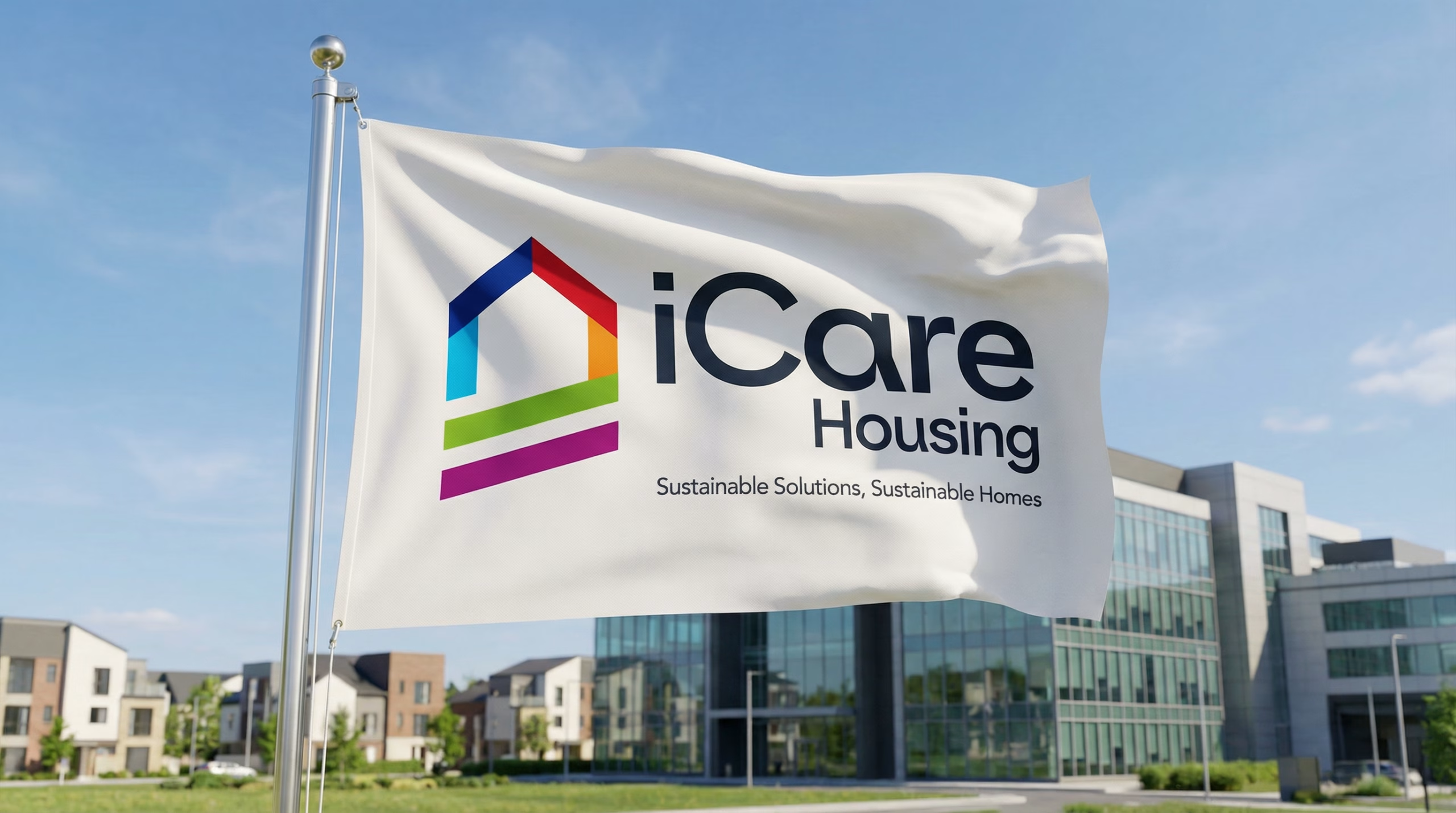
Brand identity · Social housing
Institutional credibility, human empathy.
Designing for social housing means balancing the authority the sector requires with the warmth it exists for, while avoiding the rigid clichés of property and finance.
- Client
- iCare Housing
- Sector
- Social housing
- Scope
- Logo · Visual identity refresh
- People housed
- 1,800+
The Brief
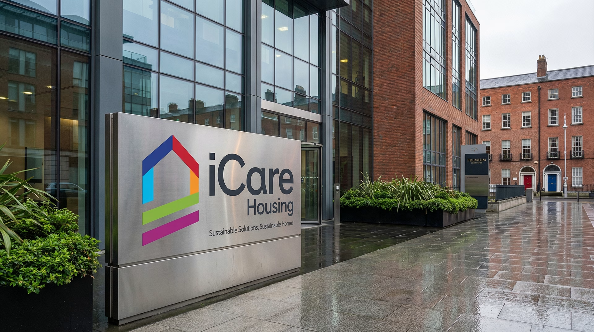
iCare Housing is a leading Irish charity and Approved Housing Body dedicated to providing sustainable housing outcomes. Having originally made their mark as pioneers in the Mortgage to Rent programme, they have since expanded into wider social housing developments, helping over 1,800 people secure safe, permanent homes.
As their remit grew, their brand needed to evolve. iCare approached Design Minds for a comprehensive visual identity refresh, anchored by a brand new logo, that would reflect their ambitious future whilst remaining deeply rooted in their core mission of care and stability.
Our Approach
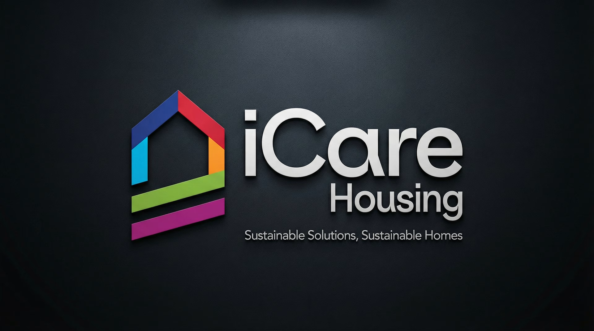
When designing for the social housing sector, the visual language must balance institutional credibility with human empathy. We set out to create a logo that visually communicates shelter, support, and optimism, avoiding the tired, rigid clichés often found in property and finance.
The goal was to craft a mark that instils immediate trust and feels universally welcoming to tenants, partners, and local authorities alike.
Does your identity still match what your organisation has grown into?
The Design
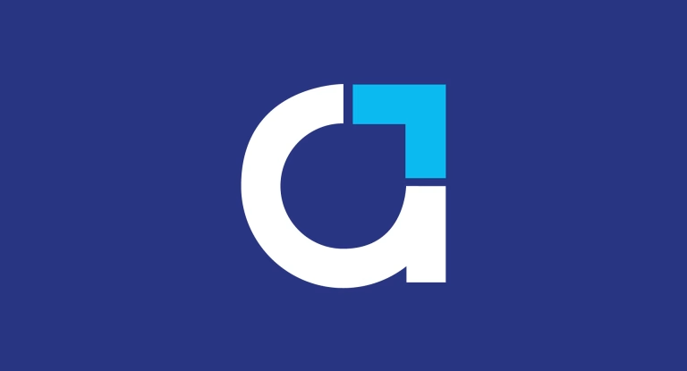
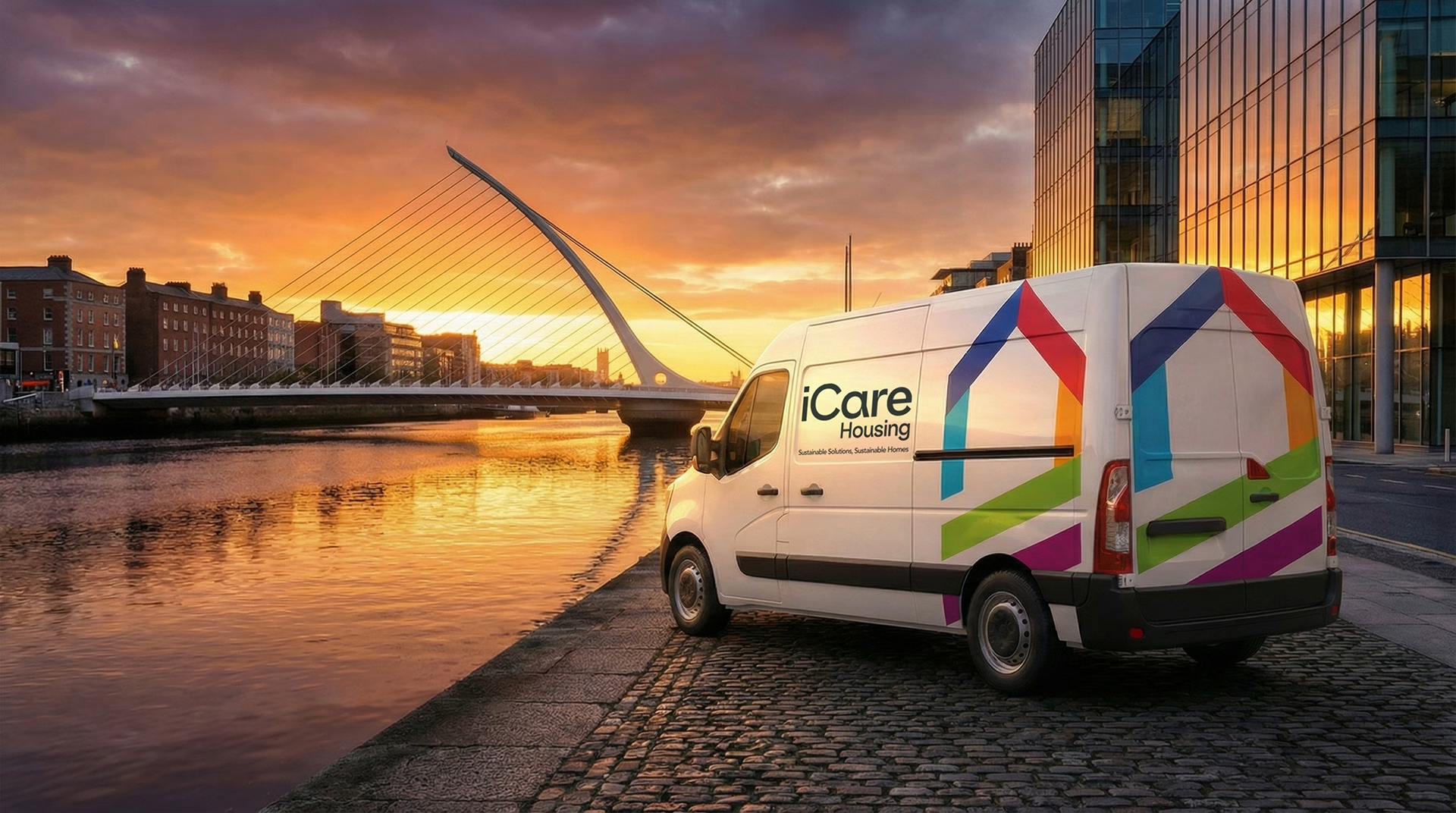
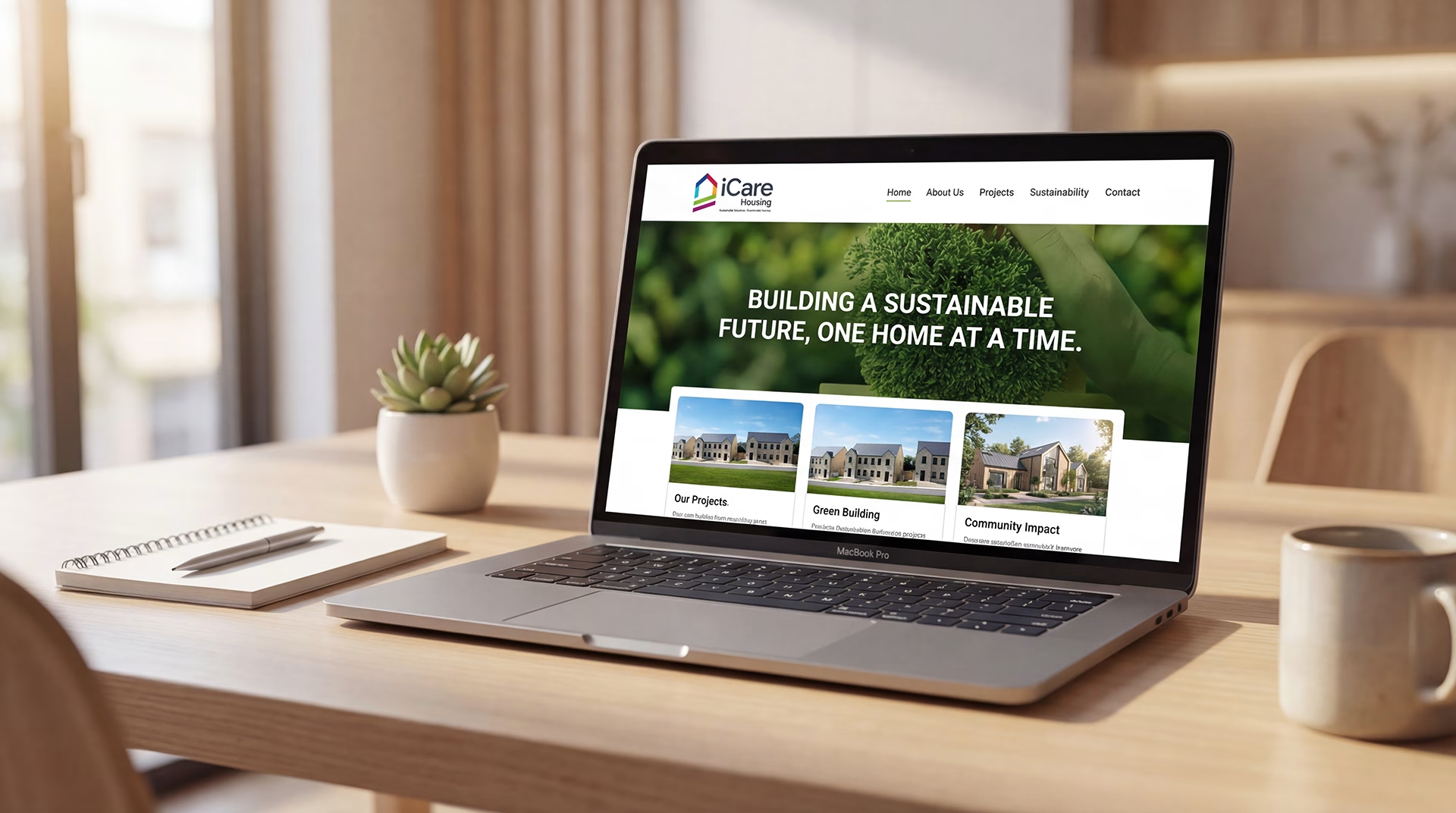
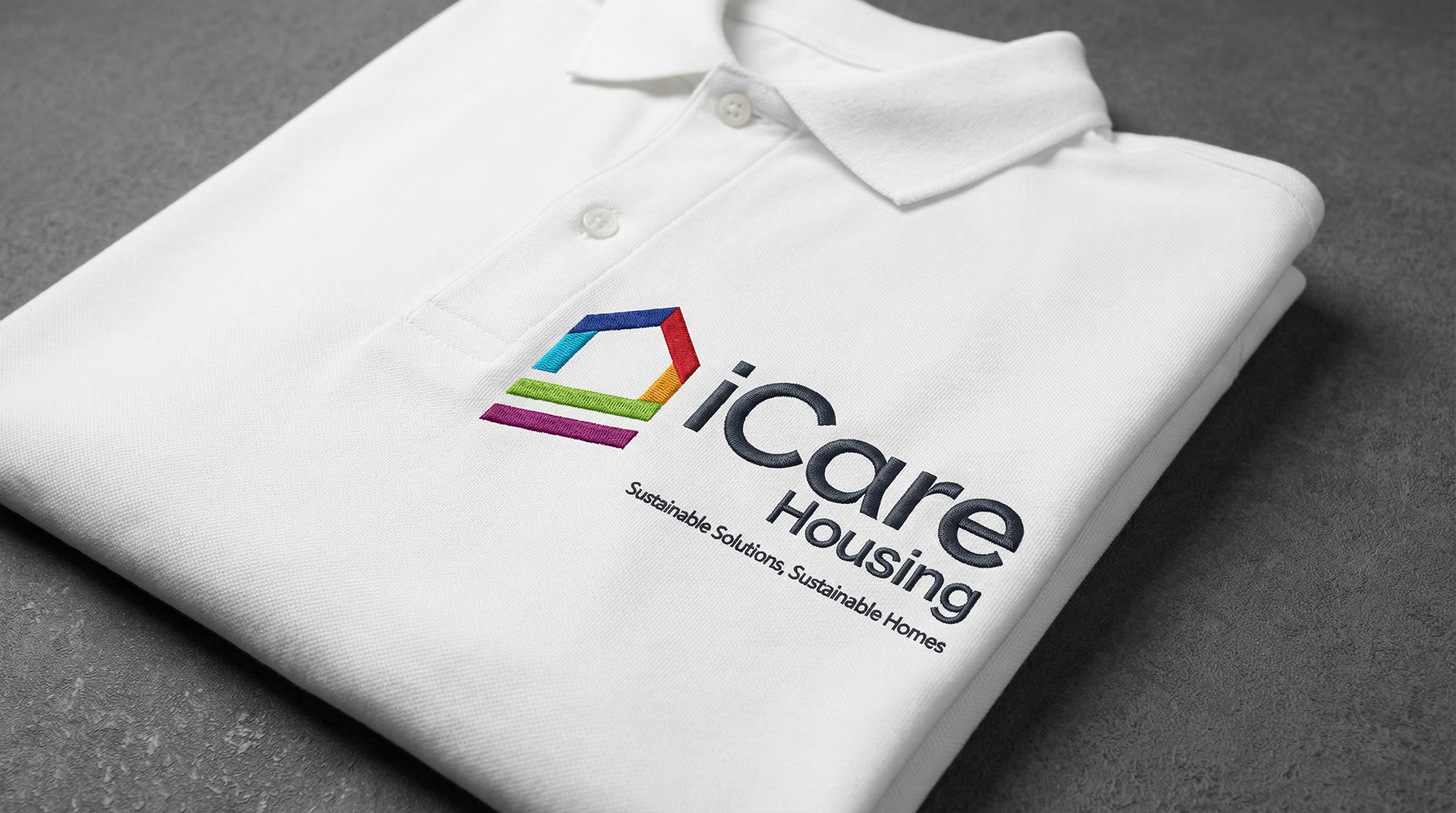
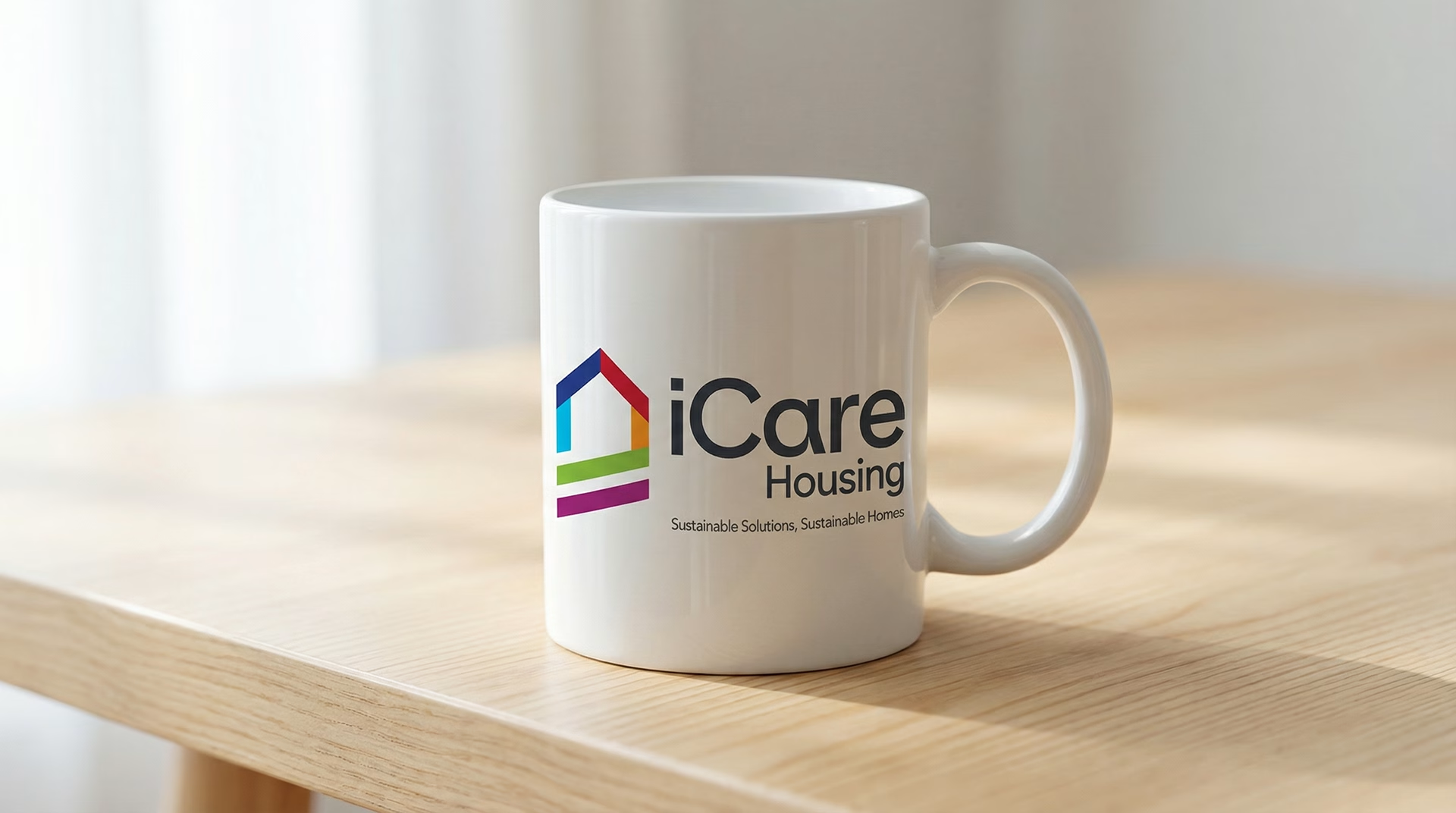
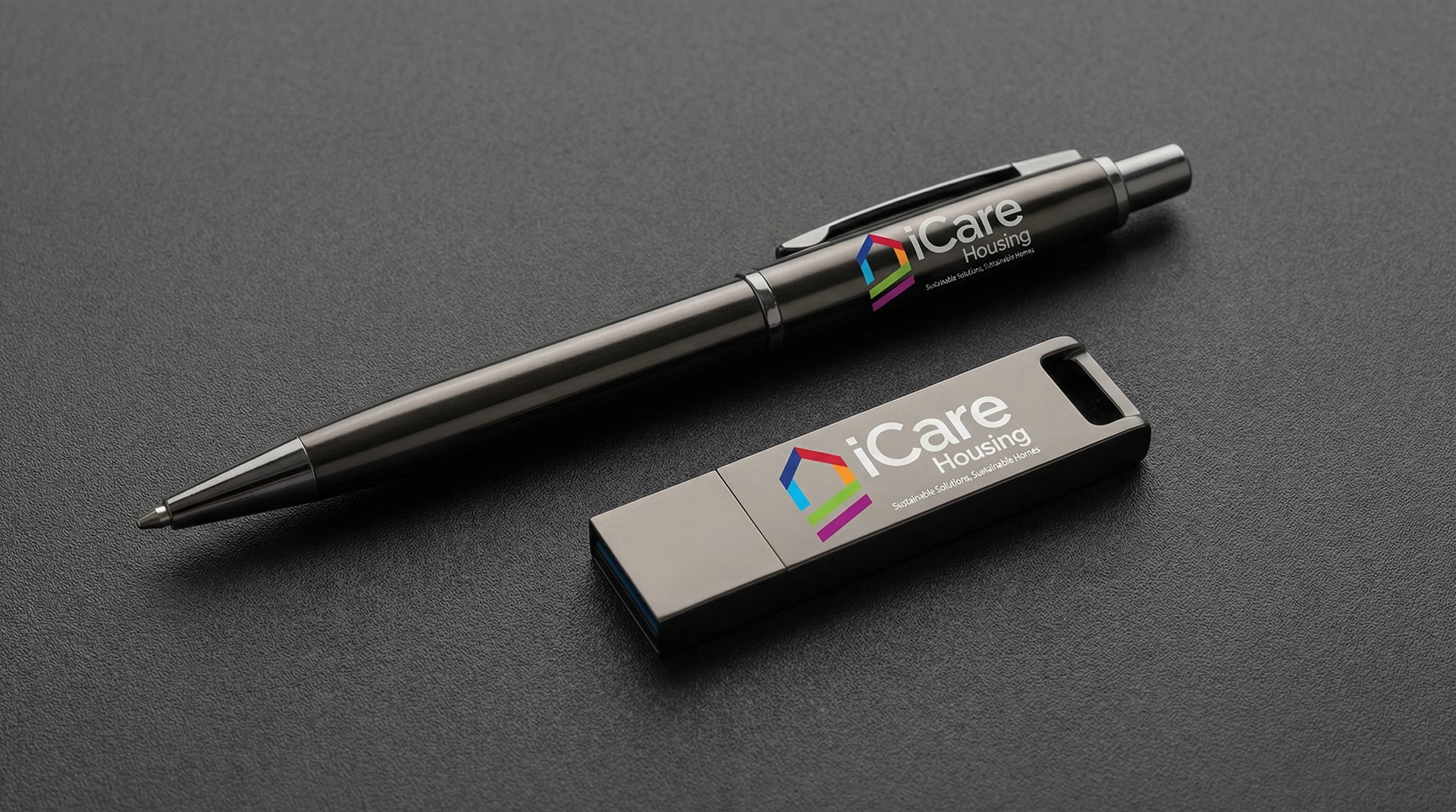
The new iCare Housing logo is built around a clean, contemporary mark that subtly evokes the structural stability of a home and the continuous, unbroken support the organisation provides.
We paired this symbol with modern, approachable typography that strips away any bureaucratic coldness. For the palette, we deliberately moved away from harsh corporate tones, selecting grounding, natural colours to emphasise renewal, community, and the promise of a fresh start.
Every element was rigorously tested to ensure it is easily recognised and highly legible across all physical and digital touchpoints.


The Outcome
The revitalised identity perfectly encapsulates iCare Housing’s guiding ethos: “Sustainable Solutions, Sustainable Homes.”
It leaves them with a confident, modern logo that honours their life-changing work, positioning them not merely as an administrative body, but as a compassionate, forward-looking pillar of the Irish community.
Tell us about your brand.
A few lines is enough to start. We’ll come back within one working day with a view on where the work should begin.