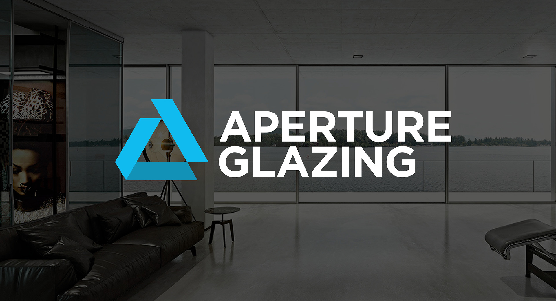
Rename & rebrand · Construction
From The Folding Door Company to Aperture.
A full rename and rebrand, rolled out across print, digital, signage and livery, for a business outgrowing the product it was named after.
- Client
- Aperture Glazing
- Sector
- Aluminium glazing
- Scope
- Rename · Identity · Website
- Year
- 2022, after 25 years trading
- Website
- apertureglazing.ie

The Brief
Aperture Glazing supplies and installs bespoke aluminium glazing, from windows, doors and sliding systems to rooflights, out of its workshop in Rathcoole, Co. Dublin. It works on everything from home renovations to architect-led projects, and it is an approved Reynaers manufacturer and installer. It had been trading for twenty-five years when it came to us in 2022, under a different name: The Folding Door Company.
That name had done its job for two decades and then quietly become a liability. The business had grown well past folding doors, but the name told every prospective customer it sold one product. As the client put it in their own announcement, the old name was restricting them and did not give the full picture of what they supply.
So the brief was a rename and a full identity, with twenty-five years of hard-won recognition to carry across rather than abandon.
Our Approach
A rename is the highest-risk form of rebrand. Everything the market already knows about you is attached to a word you are about to stop using.
Two things shaped the work. The new name had to be broad enough to cover the full range without becoming vague, and aperture is the opening itself, the one thing every product in the range has in common. And the identity had to be built for a specific reader: architects. Aperture was competing for specified projects, and the old identity was not dressed for that room.
That second decision ruled out the obvious route. Glazing and construction brands reach almost automatically for a picture of a window: the four-square pane, the frame in outline, the reflection swoosh. It is instantly readable and instantly forgettable, and it is not a language architects respect. We went the other way, with a letterform rather than an illustration.
Has your business outgrown the name above the door?
The Design
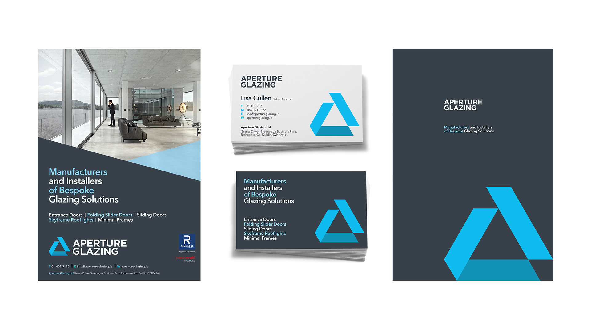
The mark is an A built in the shape of an aperture, an opening, a window on the world. It carries the name rather than describing the product, which is what allows it to cover a range that will keep growing.
It is set in a strong sans serif, because aluminium glazing is bought on strength, durability and precision, and the typography had to say so before anyone reads a line of specification.
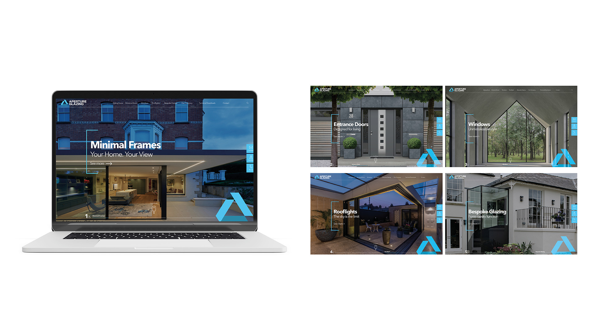
The identity was tested and built out across every surface the business uses: stationery, magazine advertising, signage, the vehicle fleet and a new website at apertureglazing.ie. Vehicle livery was the demanding application, a mark that has to hold together on a curved panel, seen from a passing car, at speed.

The Outcome
Aperture Glazing now trades under a name that covers everything it makes and an identity built for the people who specify it.
The rollout was coordinated so the new brand appeared everywhere at once rather than in fragments, and twenty-five years of reputation moved across with it.
Tell us about your brand.
A few lines is enough to start. We’ll come back within one working day with a view on where the work should begin.