Brand identity · Motor retail
Seventeen car brands. One mark that had to hold them all.
Joe Duffy Group came to us for a complete redesign of its Group identity, a mark that had to signal strength, security and reliability while sharing a forecourt with Porsche, Audi and BMW.
- Client
- Joe Duffy Group
- Sector
- Motor retail
- Scope
- Identity · Guidelines
- Year
- 2015, in service since
- Website
- joeduffy.ie

The Brief
Joe Duffy Group began in 1972 as a small garage on Ballygall Road East in Dublin 11, with four members of staff. That same year it became Ireland’s first solo BMW franchise, and sold 90 of the 180 BMWs bought in the Republic that year.
Half a century on, it is one of Ireland’s largest motor retail groups. That scale is the reason the identity needed rethinking: a mark drawn for a single garage has different work to do than one carrying 22 locations and 21 franchises.
Ballygall Road East
nationwide
17 marques
Motor retail is a sector where trust is the product as much as the vehicle is. Customers are making one of the largest purchases of their lives, often on finance, frequently on the strength of the name above the forecourt.
The brief was a complete redesign of the Group logo and its associated branding, not a refresh, and not a logo in isolation.
The name itself was both the largest asset and the tightest constraint. In Ireland, Joe Duffy means cars: five decades of earned recognition that no rebrand should throw away. The task was never to replace that equity, but to give it a structure that worked at national scale.
Our Approach
Three qualities were easy to name and hard to draw: strength, security and reliability. But the harder constraint was structural.
A Group mark in multi-franchise retail never appears alone. It shares signage, forecourts, paperwork and websites with some of the most rigorously policed identities in the world, Porsche, Audi, BMW, Land Rover. It cannot compete with them, and it cannot look subordinate to them.
That ruled out volume. The mark had to earn its authority through structure rather than scale or colour.
Group mark alongside manufacturer identities
Routes we ruled out
The performance-marketing default, italics, motion blur, chevrons. It sells excitement. The brief asked for security, which is the opposite instinct.
The palette sitting behind every motor loan. Safe, and indistinguishable from the bank rather than the retailer.
Premium by decoration rather than by structure. It reads as expensive for about a year, then dates badly, and it collapses at small sizes.
What remained had to work structurally: proportion, weight and clear space doing the job that colour and decoration usually do.
Working through a problem like this one?
Tell us about your brand.
A few lines is enough to start. We’ll come back within one working day with a view on where the work should begin.
The Design
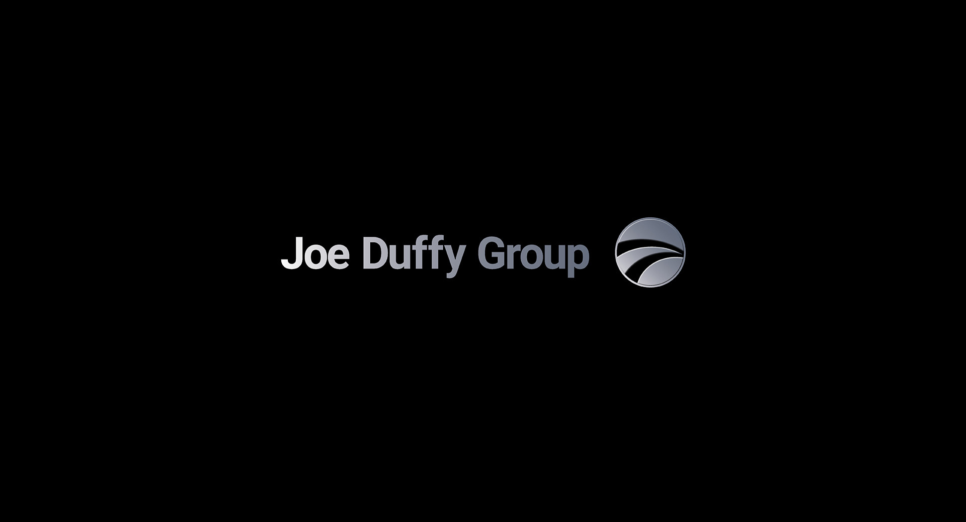
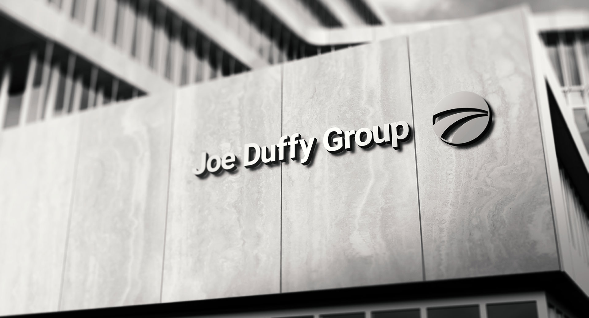
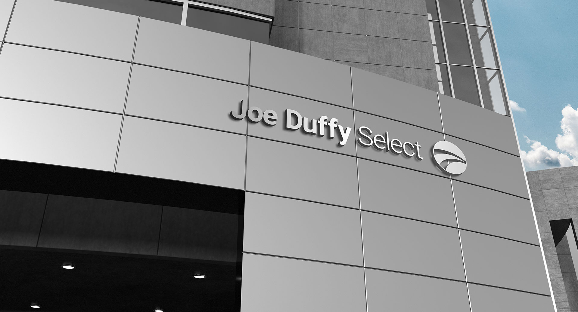
The finished mark pairs a silver wordmark with a circular device carrying a single swept curve. It is supplied in flat and metallic versions, the gradient an option rather than the default, so a signmaker, a printer and a web developer each get the version their process can actually hold. Silver rather than a colour, so it sits beside manufacturer palettes without arguing with any of them.
The hardest touchpoint
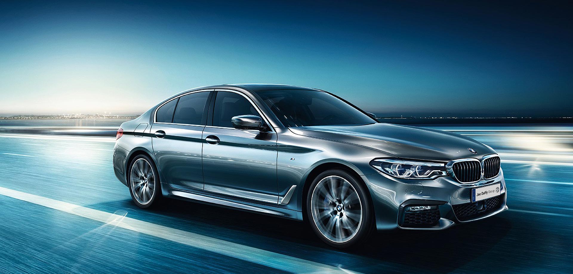
The forecourt. It is where every constraint on this project meets at once: the mark is read at speed, from a road, at an angle, often in poor light, and it is read directly alongside a manufacturer’s own signage, which is larger, lit, and designed to dominate.
Nothing decorative survives that. It decided the weight of the letterforms, the size of the counters, and the clear space, which is generous, because on a forecourt clear space is the only thing separating the Group from the marque it sells.
Digital was the second test, and it pulls in the opposite direction. The same mark has to hold a website header above 21 franchise listings, survive as a 16-pixel favicon, and stay legible on a used-car listing viewed on a phone in one hand. A mark drawn only for signage fails there; a mark drawn only for screens disappears on a forecourt.
Room to extend
The Group does not trade under one name alone. Joe Duffy Select, the premium used-car proposition, carries the same device and wordmark with its own descriptor, on its own premises, with its own forecourt.
That is the difference between a logo and a system: whether a sub-brand can be added without the parent being redrawn.
The Outcome
The mark was drawn in 2015. It is still in service.
2015, 2026
In that decade the Group has grown to 22 locations, over 610 employees and 21 franchises. The identity drawn for the business as it stood in 2015 has carried it through that expansion, without being redrawn.
It has been applied consistently across print, digital, signage and vehicle livery throughout. That consistency is what guidelines exist to make possible, and it is the reason the Group still reads as one identity across 22 sites and 17 manufacturer brands.
That is the real test of an identity, and most fail it. A mark that needs replacing when the business grows was drawn for a moment rather than for a company.
Brand guidelines were delivered as standard, logo versions, clear space, minimum sizes, colour values for print and screen, and typography. Across 22 sites and 610 employees, that document is what keeps the identity consistent whether it is applied by a printer, a signmaker or someone in their first week.
“The team goes far beyond a simple change of logo, and instead provides a more comprehensive branding service to customers.”
Alan Gilligan, Joe Duffy Group