Retro Logos
Vintage is everywhere. From the revival of flip phones to the relaunch of the ZX Spectrum, retro mania is on the up and up. And while you might think that demand for such gadgets comes from nostalgic 40-somethings, it’s clear that youngsters who missed out on the technology first time round want a piece of the action too – resurgence of retro-tech sales of vinyl records and the ‘new’ polaroid instant camera is led by the 18-24 demographic.
Time Honoured Logo Designs
With such an appetite for all things retro, it’s little wonder that logo design is being swept along by the current trend. But what about the ‘real’ old school logos from the past? Not all of them have been lost in the mists of time – the real classics have staying power, remaining resolutely unchanged over the years, refusing to morph with passing fashions.
British Rail
In the 1960s, Britain’s transport industry was in a state of flux. The allure of the open road beckoned motorists with the promise of freedom, while travel by train looked increasingly unappealing and outdated. In a bid to modernise its image, British Railways commissioned a radical rebranding campaign.

After considering dozens of professional designs, the honour finally went to Gerry Barney whose design remained unmodified from his first back-of-an-envelope sketch. Like all good designs, the logo cleverly incorporates several elements with clarity and elegance – parallel lines and two interlocking arrows to symbolise the railway network. It rapidly became one of our most familiar and iconic logos and is still alive and kicking as the established symbol for UK railway stations. Despite its apparent simplicity, the ‘double arrow’ logo is surprisingly difficult to draw correctly from memory – go on, give it a try.
Campaign for Nuclear Disarmament (CND)

Designed in 1958, the CND Logo has become a classic icon for peace movements the world over. Its enduring appeal is testament to the skill of Gerald Holtom, a professional designer with a deep affinity for the cause. The symbol is particularly effective as a pin badge. This proved to be the perfect medium for spreading awareness to the masses, and worked brilliantly as an early form of viral campaigning.
Amnesty International
![]()
TheAmnesty Candle blends two concepts by combining two separate visual elements. First there is the burning candle, a symbol of hope, while the encircling barbed wire evokes a sense of oppression. The result is a very simple yet powerful image which is still recognised and respected the world over.
Retro Revival
The interesting thing about these three logos is that they have not dated. Society and technology has changed around them, but they have retained their integrity and look perfectly at ease in the world today. The current trend towards ultra flat, pared down design might seem like a new thing – after all, this trend is driven by the latest design technology for smartphones and smart watches – but these logo designers got there first.
How many of retro-revival designs of today will prove to be as resilient as these classics?
How To Develop A Coherent Brand Style
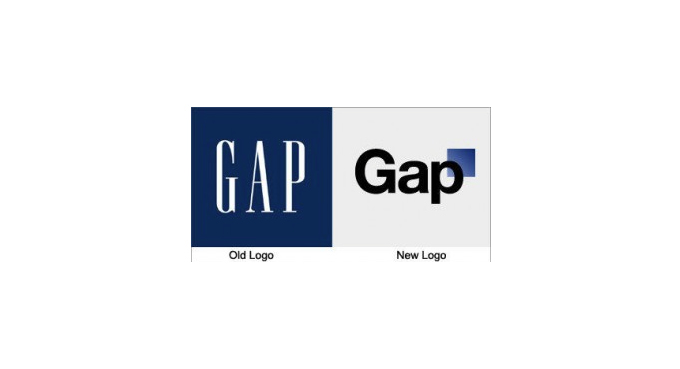
If tales from the world of big business branding have taught us anything, it has to be this: Once you’ve established your brand identity and built up a loyal customer base, think very, very carefully before changing a thing. High street retailer Gap is one such giant to find out to its cost how unwise a hasty rebrand can be. In the run-up to Christmas 2010, without warning, the company replaced its familiar iconic logo for an insipid unknown. Customers loyal to the brand whipped up a backlash that was swift and merciless. This prompted a speedy change of heart from Gap: the new-look logo lived for a mere six days.
Branding is Reputation
Gap learnt the hard way that once your brand is on a solid footing, there is great danger in suddenly veering off course in response to a passing fad or in pursuit of new customers. Consistency is key, and a coherent brand style is especially important when it comes to websites and social media. With so much click-bait out there luring people away, you may only get a few seconds to make an impact and build a lasting impression.
Most big brands know this only too well. They publish Style Guides to inform employees, businesses and the public of the rules they need to follow to guarantee the consistency of the brand. Also known as the Brand Bible, these guides set out strict instructions on what can and can’t be done with core visuals such as logo, colours and layout.
Take a look at these examples. You may not think you need a full Brand Bible of your own, but they will give you some idea of what a brand style guide has to offer.
Skype Brand Book

The Skype Brand Book may have an informal, witty style, but the underlying message is clear: Do Not Stray Outside These Rules! It covers everything from how the logo must appear and what you are definitely not allowed to do with it, to permitted typeface and colours, how to make a Skype cloud and how to decorate your cloud with a few of their authorised illustrations. By the end you will certainly begin to appreciate that consistency and coherence of the Skype brand is of great importance… and then some.
Cambridge University

By contrast, the University of Cambridge guide to branding is formal in tone, but the rules are very similar. There are instructions on the size and positioning of the logo, the approved colour palette, typography and layout.
Channel 4

The Channel 4 Identity Style Guide treads familiar territory with instructions on the correct size and positioning of the logo, font and colour choice, but it also has interesting guidance on Tone of Voice and Writing Copy. Channel 4 has a brand identity that is irreverent and challenging, and this is reflected in the overall spirit of their Style Guide: it feels somewhat less stifling and more open to playfulness.
These examples show the importance of developing a coherent brand style. Putting together a basic guide will help you to keep your branding consistent, establish your identity and encourage brand loyalty in your target audience.

Is Your Logo Standing Out From The Crowd?
Picture this. A lavish wedding cake set on a silver stand. Your imaginary cake probably looks something like this: A tower of multiple tiers decorated with perfectly smooth, white icing and perhaps a cascade of sugar flowers and a miniature happy couple standing together on the top.
Just as a wedding cake is made up of a number of recognisable component parts, your logo will be put together using a selection of intrinsic design elements. But how do you give it that certain extra something to make it stand out from all the crowd?
Here are four tips to make your Logo stand out:
1. Fit In
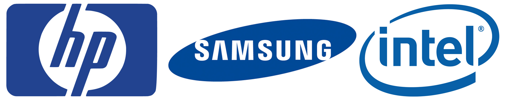
Your logo is integral to your brand – it needs to communicate a strong message to your customers so that they understand in an instant who you are and the kind of business you’re in. That’s a lot to ask from a simple, visual design, but if you check out logos of similar businesses, you’ll find that they generally share certain qualities. For example, tech company logos such as HP, Dell and Intel, tend to opt for a cool blue colour palette and uncluttered, businesslike design. Fast food logos have a buzzier, more exciting feel by using loud colours and flashy fonts. Take a look at the logos of your competitors – do they share particular characteristics? You may not want your logo to blend in to the point where it becomes indistinguishable from the rest, but nor do you want it to look like a complete o utsider.
2. Focus on your Core Values
It may seem like an airy-fairy thing to do, but identifying the principles and beliefs that underpin your business will help you to bring meaning and integrity to your logo. Communicating your core values through your logo will attract the attention of your target audience and start to build up that all important brand loyalty.
3. Add that Special Ingredient
What does your business have to offer that sets you apart from your competitors? If you can identify the elements that make your business special and incorporate them into your design, you will have a logo that stands out from the crowd. Sometimes it is that bit of extra flair that makes all the difference, especially if it conveys the unique character of your business.
4. Test it Out
Getting feedback at the design stage will help you avoid the expensive and embarrassing mistake of going live with an ill-judged logo. It’s also worth testing your logo to see how it looks in different formats such as scaled up or down, on printed material, promotional goods and in greyscale.
Standing out from the crowd is only one element of an effective logo design, there are many other aspects to consider along the way. Just as a wedding cake needs to be memorable for all the right reasons,your logo requires skillful design to bring it to life and make it uniquely yours. Once you own a logo to be proud of, you can put it straight to work to draw in customers and get your business off to a flying start.
Is Your Logo A Shirker Or A Worker?
Whether you know it or not, your logo is an intrinsic part of your workforce, a tireless ambassador for your brand. Or, at least, that’s how it ought to be. A well designed logo really can be a powerful asset to your business, pulling in your target customers and winning brand loyalty. To achieve this, your logo needs to look the part and give off all the right signals as it makes its way in the world.
A logo built on firm foundations will have genuine confidence and integrity that will set it ahead of the competition. Take a look at these examples of classic logos, and notice how they embody the character and spirit of their brand with strength and assurance.
JCB and CAT
Designed in 1953, the JCB logo is a familiar sight on JCB diggers, trucks and forklifts the world over. With its no-messing-around lettering and distinctive black and yellow colour scheme, the logo picks up the flavour of those warning hazard stripes that are frequently used around construction sites. If you take a look around at companies in a similar line of business, you’ll see a theme developing. The Caterpillar Company CAT goes for the same distinctive yellow and black colour scheme with its iconic CAT Triangle. This famous yellow triangle even brings in additional revenue of the company through merchandising, making it a nice little earner. JCB is also tuned in to this additional stream of revenue with the JCB Shop selling everything from JCB scale models to watches, hats and USB sticks.

Lego
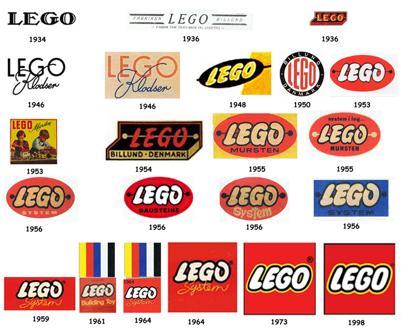
Generations of children have grown up with Lego, so it’s little wonder that Lego has the go-to logo when it comes to branding toys and games. Established in Denmark in 1932, the logo has evolved over the years into the simple, bright red and yellow friendly lettering we know today. The rounded, playful font choice has been part of the design since the 1950s, and has become a benchmark for branding products aimed at children. Other toy logos with the bright colours/bubbly font combination include Play-doh and Crayola.

WWF
Launched in 1961 this global charity has one of the most iconic and enduring logos of all time. The founders wanted a symbol to embody the plight of all endangered species driven close to extinction, and the Giant Panda was the perfect choice. All credit to conservationist Sir Peter Scott, who had both the vision and design skills to create the original logo. Apart from a few tweaks over the years, the WWF Panda is still going strong and attracting supporters to the cause.
Creating a successful logo that reflects the personality of your business takes skill, artistic flair and a sound understanding of the principles of logo design. Invest in a designer to create your own unique logo, and it will give you years of loyal service representing your company and promoting your brand.
![]()
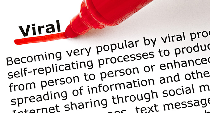
Tips For Making A Corporate Video Go Viral
What makes a corporate video go viral? Truth is, no-one really knows. There’s no magic formula, no tried and tested route to success. That might sound like a downer, but think of it this way: it opens up the field to one and all, adding spice and excitement to the whole enterprise. And even though there is no guaranteed method of making your video fly, it’s worth taking a look at the ones that have gone viral for ideas and inspiration.
So, if you are looking to turbo-boost your own promotional video, here are a few pointers for you to consider.
Start With a Solid Foundation.
The corporate videos that make it big have very firm roots – they are carefully designed to give a clear message to their customers and promote their brand. Your video is going out there to pitch your business to the world, to draw in your core customers and attract new ones. At the planning stage, consider how your video will appeal to your target audience. Focus on the core values of your business as a kick-off point: How will you creatively communicate these to your audience through your video? By pinning down the message you want to convey, you will create a video with integrity that resonates with your target audience.
A great example is the Dove brand Real Beauty Sketches video. In keeping with the Dove mission, this three minute video gives a powerful insight into the concept of beauty and encourages women to develop confidence in the way they look. The resulting video is strongly engaging and leaves a lasting impression.
Think of the Bigger Picture
If you are serious about making a video you hope will go viral, it’s best to integrate it into an overall marketing strategy rather than treat it as a one-off vanity project. Ask yourself what you want to accomplish. For example, if your goal is to attract customers and boost business, you need to build in a clear take-away message. A viral video that leaves people with no clue about who you are or where to find you is a hugely wasted opportunity. Make sure you design in these details at the planning stage, and brace yourself for the rush of customers if your video makes it big.
Plan the Plot-line
Many of the most successful videos have an overarching narrative to draw in the viewer and keep them watching to the end. Nothing illustrates this better than the Volvo Trucks video featuring Jean-Claude Van Damme performing The Epic Split Feat. Crafted to perfection? You bet!
and finally…
Keep it Short
This is where the art of skilful editing comes into its own. After making that all-important first click, most people will check the running time of a video before committing to watching the whole thing. Short videos stand more chance of going viral, so shave off as much as possible while keeping the overall structure intact. Hats off to Google for their super short Chrome: For Everyone series.
Using Colour During Logo Design
Colours are everywhere, speckled around our world in a multitude of alternative shades – each one different to the last. When it comes to designing a logo, you’ll need to think long and hard about selecting which kinds of colours to use. Sure, you may have your favourite tints and shades – the colours that you’ve always been keen on. But in order for a logo to work to the best of its ability you’ll need to put aside your personal tastes (for the most part) and think about what’s best for the consumer.
The Psychology Of Colour
The very first thing to consider when applying colour to your logo design is the psychological effect that your chosen shade will have on the consumer. As we grow, our minds come to associate particular colours with particular traits, ideas and concepts. This means that colours have the ability to trigger a specific emotional response – stimulating the senses to provoke both positive and negative reactions. Listed here are some of the main shades you might apply to your logo, and their psychological effects:
RED
The colour red is associated with strong emotions such as passion, intensity, urgency and love. Research has revealed that people react to this colour in strong ways (stimulated heart rate, increased sense of eagerness) which is why many brands use it to their advantage to encourage impulse buying. Red has also been proven to increase appetite – with McDonald’s and Walker’s being two examples of big brands who use this psychological effect to their benefit with their bright red logos.
BLUE
The colour blue is often linked to the concept of peace, serenity and calmness. These effects make it perfect for a brand who wants a consumer to feel that they can trust them – which is what makes it a particularly popular choice among political parties. Blue is also related to the aspect of healthy communication – and is often used in work spaces that operate by means of brainstorming and teamwork. It’s no accident that both Facebook and Twitter use a bright shade of blue in their logos to advertise their highly communicative social media sites.
GREEN
Green is a colour that people frequently tend to associate with health, happiness and good-will. It’s a natural choice for nature-based brands like Animal Planet and food produce brands like Starbucks, as it suggests clean, healthy development and manufacturing. It’s also a colour that’s related to the concept of relaxation, and products wishing to send out a soothing message to their consumer often slip in a shade of green into their logo to reinforce a sense of tranquility and ease.
YELLOW
Yellow is a little like the colour red in how it has the ability to generate strong emotions in human beings. It’s sunny and cheerful which provokes a happy reaction much of the time, but it has also been proven to instil a sense of self-belief, optimism and concentration in consumers too. It remains a popular choice for playful products and brands such as SPIKE TV and IKEA, but it’s also used frequently by companies wishing to draw on the consumer’s logical side – such as The Yellow Pages.
The use of colour can go a long way in terms of how it can effect a consumer. Think carefully about what sort of reaction you want your brand to provoke before deciding on a final shade. What’s your brand personality? Do you want a consumer to be happy, calm or stimulated they see your logo? Select the correct colour to help increase the logo’s overall impact.
The Stories Behind Famous Logos
Ever look at a logo and wonder how on earth the creators ever came up it? As a budding designer, no doubt this thought will have crossed your mind more than once – and there are actually some fascinating stories that hide behind a few of the world’s most famous logos. Listed below are some of the ways in which several of these recognisable designs came to fruition. Drawing on their inspiration might even assist you when it comes to creating your very own logo in the future.
![]()
Salvador Dali Was Behind The Chupa Chups Lollipop Logo
That’s right – the mind behind surrealist masterpieces such as The Persistence Of Memory was actually the same mind that conjured up the design for Chupa Chups lollipops. Although nowhere near as strange as some of his typical work, Dali’s logo idea for wrapped candy on a stick still differed from many typical brands at the time. Instead of slapping the curly lettering on the side of the wrapper, he plonked the words on top – allowing for a distinguishable and easily readable name that the public would catch sight of without having to twirl the lollipop around in their hand. A small change – but a significant one.
![]()
The Word “Mom” Is Hidden In Wendy’s Collar
American fast-food diner Wendy’s has always tried to create the image of a company that produces food using home-cooked recipes like the ones your mother used to use. As such, the word “Mom” is actually visible on the collar of Wendy in the logo. Three blue stripes on either side symbolise the “M” letters, whereas the circular necklace represents the letter “O” in between. Cute, huh?
![]()
The NBC Logo Creates The Appearance Of A Peacock
If you take a closer look at the logo for the television broadcasting company NBC, you’ll notice that there’s a white space sandwiched between the six different sprouts of coloured shapes on either side. This was drawn specifically to create the appearance of a peacock spreading its wings – reflecting how “proud” NBC is of the programs it produces.
![]()
The Sony VAIO Logo Contains The Symbols For Analogue And Digital Signal
The Sony VAIO logo is one of the most shrewd and intelligent logo designs you’re likely to find. The “V” and “A” are shaped in a wavy way to represent the signal for analogue, whereas the “I” and “O” are drawn in a way that makes them take the appearance of a “1” and “0” – the signal for digital. One quick glance at the Sony VAIO logo will reveal how the company dabbles in both analogue and digital modes of technology.
![]()
The Toyota Symbol Contains Three Hearts
The Toyota symbol is a little more intricate than the symbols used for other car companies, and that’s because it’s trying to say something rather specific. Within the symbol are three interconnected ellipses, all of which represent the unification of three separate hearts – the heart of the customer, the heart of the company, and the heart of progress in technology.

5 Signs Your Website Needs A Re-Design
Nothing is forever. You might have designed a tip-top website that you were enormously proud of a few years back, but the internet is forever evolving, and at an astonishingly rapid pace. If you’re averse to change, you’re going to get left behind. Chances are, a landing page that looked terrific a few years ago won’t look quite so good anymore. Listed here are five signs that your website is in desperate need of a redesign.
1. It’s Tough To Find Your Way Around
If you can’t find your way around your own website with ease, a customer isn’t going to have the slightest chance. Websites have developed to the point where navigation has become extremely easy, and if your domain is stuck in the dark ages where search bars and tabs are non-existent, any potential customers will take one quick, scornful look at your site before promptly bailing out. Remember, the human attention span is not showing any signs of lengthening! Take the time to have a good long look at your webpage, and if finding a particular piece of information proves difficult, make sure you put “ease-of-navigation” at the top of your priority list when it comes to revamping.
2. It’s Not Optimised For Mobile
Mobile web browsing is more common than ever nowadays, and if your website isn’t optimised for smartphones and tablets, you’re going to be missing out on a large number of hits and potential customers. Any webpage that’s more than a few years old is unlikely to be optimised for smaller portable and touchscreen devices – and if your site falls into this category, you’ll need to get thinking about making it suitable for mobile browsing as quickly as possible. Today’s sites need to be able to detect the kind of device a visitor is using, and adapt accordingly.
3. It’s Not Visible On Search Engines
If your website is stuck on page 31 of Google, the odds suggest that it’s never going to get seen. To boost your site higher up the search engine rankings, you’ll need to take the time to post fresh and relevant content on a regular basis, whilst also keeping the vital art of Search Engine Optimisation (SEO) in mind. Without taking these actions, your website is forever doomed to sit in the lower reaches of Google’s result pages, that almost nobody ever visits.
4. It Lacks Strong Calls To Action
If your site is trying to sell something, you’ll need a wide selection of strong Calls To Action across several pages, in order to convince visitors to keep hanging around. These are more important than ever in the world of website design, and without effective CTA’s placed at appropriate points around your site, your potential customers will tend to wander away from it without buying your wares.
5. It Looks Old
A no-brainer really, but if a website looks a little dated it’ll send customers running for the hills rather than keeping them curiously clicking around. It’s worth making every effort to develop your website into something slick and sexy – and doing some serious research into the kind of user-friendly applications and elements that’ll work specifically for your target audience.
5 Common Branding Mistakes
Branding is a tricky task, and it should come as no surprise to learn that brand owners continue to make the same mistakes over and over again when attempting to earn their new creation a degree of healthy exposure. Listed here are five common branding errors, all coupled with suggestions on how to avoid them.
1. Resistance To Change
Resisting change is arguably the biggest a mistake you can make with regards to your brand. The marketing world moves at a mind-boggling pace – a pace that entrepreneurs, business owners and designers are often reluctant to adjust to. Why? Because adjusting to this pace may mean drastically changing the creation they put so much work into. It may also mean having to learn about something new that they don’t understand.
For example, older brand designers may be extremely averse to entering the social media world – an area of the internet that they don’t fully comprehend. Problem is, if you’re not willing to change your brand, you may get left behind. Be honest with yourself about your brand, and if you think it may be going stale, perhaps it’s time for a rethink about your ideas and methods.
2. Attempting To Appeal To The Entire World
Why choose a specific audience when you can sell to absolutely everyone? Well, because it’s impossible – that’s why. It’s not unusual for an upcoming entrepreneur to expand their brand, in an attempt to incorporate as many potential customers as possible, but this demonstrates a distinct lack of knowledge about the world of marketing – and very often ends in tears. Don’t overcomplicate things. Pick an audience, reel them in, and keep your brand’s focus and aims nice and simple.
3. Indecisiveness & Inconsistency
A good brand changes when the time is right. A bad brand changes repeatedly for no good reason. The fast-moving modern marketing world will almost certainly require you to tweak things here and there from time to time, but changing your brand too frequently, or too dramatically, will alienate you from your audience. You need to be recognisable and familiar to your customers, otherwise you risk losing them forever.
4. Following The Herd
There’s nothing wrong with being inspired by the bigger brands to head in a particular direction. However, outright cloning will not only make you a laughing stock in the brand world, it’ll also get you into extreme difficulties with copyright law. When it comes to establishing your brand name, differentiation is key. Hat your business offers may have similarities to a highly familiar brand name, but you need to offer something new in order to attract your own audience. Think carefully about what your brand offers that absolutely no other creation does. Why would a customer pick you instead of another brand? Don’t follow the herd. Stand out from it.
5. Thinking That Your “Brand” Is All About Your Logo
A surprisingly common mistake made by entrepreneurs and business owners is assuming that the brand is synonymous with the logo. Yes, this is the image that represents your creation, but it doesn’t matter how intriguing it may be if you don’t reinforce some of your brand values elsewhere. Create a set of rules and guidelines for your brand, work on establishing a particular tone of voice, and integrate these ideas consistently across the board.
How To Build Brand Loyalty
How To Build Brand Loyalty
Developing a loyal and committed audience for your brand is key to its overall success. Discussed here are five key ways to build brand loyalty.
Give Your Brand A Story
People love stories. By explaining the origins and roots of your brand name and how your creation came to be, audiences will immediately begin to feel as though they know your brand. Familiarity, trust and intrigue are all absolutely vital when building a brand with a fine reputation, and you can spark every one of these facets by taking the time to produce a fascinating, illustrious backstory about the brand for your customers.
Make Promises You Can Keep
It’s one thing to promise something, and another not to deliver. Customers expect you to keep your promises – especially the ones in print. You could potentially reel in customers by the bucket load by telling them exactly what they want to hear, but if you fail to follow up on these guarantees they’ll never, ever trust your brand name again. Be honest with yourself and examine exactly what your brand is capable of. Make promises you can keep – and watch your audience develop and thrive as a result.
Keep In Touch With Your Customers
A completed transaction should never signal the end of the customer experience. In fact, it should be the very beginning. Keep in touch with your customers by means of a newsletter, e-mail and text message – letting them know how greatly you appreciate their support and what exciting things your brand will be offering them in the future. However, you’ll need to make sure you don’t invade their personal space and contact them too frequently or you’ll risk appearing spammy. Throw them a follow-up note and occasionally remind them about what your brand can offer rather than bombard them with info.
Reward Your Regulars
Just because a customer becomes a regular doesn’t mean you should leave them be. Don’t treat them as a source of guaranteed income like so many other brands do – offer them further incentives to keep coming back and spending even more on your product. Loyalty systems are held in high regard by consumers, and by rewarding your audience in some way you’ll only increase the chances of them coming back and spreading the word about your brand to their friends.
Encourage and Embrace Feedback
No doubt you will have come across companies asking you a follow-up question such as “How did we do?” after using their services. As it turns out, there’s a very good reason for this. Taking aboard feedback – regardless of whether it is positive or negative – is absolutely essential when it comes to creating a successful brand. If you don’t realise and acknowledge your mistakes quickly, by the time you come to rectify the issues it may be too late and your customer will have vanished forever. Seek feedback from customers about what sort of experience they had with your brand – always remembering to thank them for their time. When they next interact with your creation/product – clearly show them how you’ve taken aboard their suggestions and how you’ve acted accordingly to improve your brand. Nothing will make your customers feel more appreciated than that.