Retro Logos
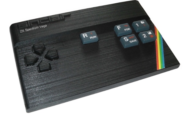
Vintage is everywhere. From the revival of flip phones to the relaunch of the ZX Spectrum, retro mania is on the up and up. And while you might think that demand for such gadgets comes from nostalgic 40-somethings, it’s clear that youngsters who missed out on the technology first time round want a piece of the action too – resurgence of retro-tech sales of vinyl records and the ‘new’ polaroid instant camera is led by the 18-24 demographic.
Time Honoured Logo Designs
With such an appetite for all things retro, it’s little wonder that logo design is being swept along by the current trend. But what about the ‘real’ old school logos from the past? Not all of them have been lost in the mists of time – the real classics have staying power, remaining resolutely unchanged over the years, refusing to morph with passing fashions.
British Rail
In the 1960s, Britain’s transport industry was in a state of flux. The allure of the open road beckoned motorists with the promise of freedom, while travel by train looked increasingly unappealing and outdated. In a bid to modernise its image, British Railways commissioned a radical rebranding campaign.

After considering dozens of professional designs, the honour finally went to Gerry Barney whose design remained unmodified from his first back-of-an-envelope sketch. Like all good designs, the logo cleverly incorporates several elements with clarity and elegance – parallel lines and two interlocking arrows to symbolise the railway network. It rapidly became one of our most familiar and iconic logos and is still alive and kicking as the established symbol for UK railway stations. Despite its apparent simplicity, the ‘double arrow’ logo is surprisingly difficult to draw correctly from memory – go on, give it a try.
Campaign for Nuclear Disarmament (CND)

Designed in 1958, the CND Logo has become a classic icon for peace movements the world over. Its enduring appeal is testament to the skill of Gerald Holtom, a professional designer with a deep affinity for the cause. The symbol is particularly effective as a pin badge. This proved to be the perfect medium for spreading awareness to the masses, and worked brilliantly as an early form of viral campaigning.
Amnesty International
![]()
TheAmnesty Candle blends two concepts by combining two separate visual elements. First there is the burning candle, a symbol of hope, while the encircling barbed wire evokes a sense of oppression. The result is a very simple yet powerful image which is still recognised and respected the world over.
Retro Revival
The interesting thing about these three logos is that they have not dated. Society and technology has changed around them, but they have retained their integrity and look perfectly at ease in the world today. The current trend towards ultra flat, pared down design might seem like a new thing – after all, this trend is driven by the latest design technology for smartphones and smart watches – but these logo designers got there first.
How many of retro-revival designs of today will prove to be as resilient as these classics?