How To Develop A Coherent Brand Style
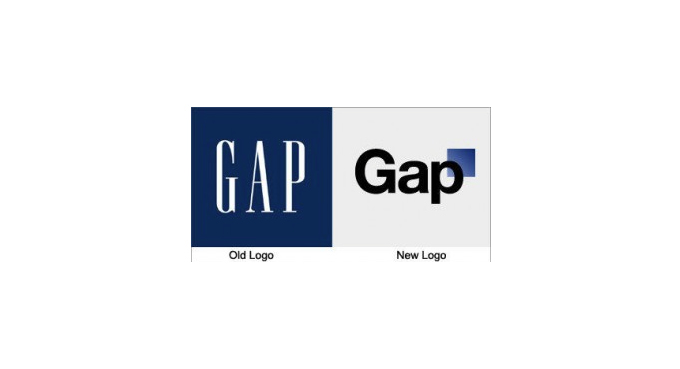
If tales from the world of big business branding have taught us anything, it has to be this: Once you’ve established your brand identity and built up a loyal customer base, think very, very carefully before changing a thing. High street retailer Gap is one such giant to find out to its cost how unwise a hasty rebrand can be. In the run-up to Christmas 2010, without warning, the company replaced its familiar iconic logo for an insipid unknown. Customers loyal to the brand whipped up a backlash that was swift and merciless. This prompted a speedy change of heart from Gap: the new-look logo lived for a mere six days.
Branding is Reputation
Gap learnt the hard way that once your brand is on a solid footing, there is great danger in suddenly veering off course in response to a passing fad or in pursuit of new customers. Consistency is key, and a coherent brand style is especially important when it comes to websites and social media. With so much click-bait out there luring people away, you may only get a few seconds to make an impact and build a lasting impression.
Most big brands know this only too well. They publish Style Guides to inform employees, businesses and the public of the rules they need to follow to guarantee the consistency of the brand. Also known as the Brand Bible, these guides set out strict instructions on what can and can’t be done with core visuals such as logo, colours and layout.
Take a look at these examples. You may not think you need a full Brand Bible of your own, but they will give you some idea of what a brand style guide has to offer.
Skype Brand Book

The Skype Brand Book may have an informal, witty style, but the underlying message is clear: Do Not Stray Outside These Rules! It covers everything from how the logo must appear and what you are definitely not allowed to do with it, to permitted typeface and colours, how to make a Skype cloud and how to decorate your cloud with a few of their authorised illustrations. By the end you will certainly begin to appreciate that consistency and coherence of the Skype brand is of great importance… and then some.
Cambridge University

By contrast, the University of Cambridge guide to branding is formal in tone, but the rules are very similar. There are instructions on the size and positioning of the logo, the approved colour palette, typography and layout.
Channel 4

The Channel 4 Identity Style Guide treads familiar territory with instructions on the correct size and positioning of the logo, font and colour choice, but it also has interesting guidance on Tone of Voice and Writing Copy. Channel 4 has a brand identity that is irreverent and challenging, and this is reflected in the overall spirit of their Style Guide: it feels somewhat less stifling and more open to playfulness.
These examples show the importance of developing a coherent brand style. Putting together a basic guide will help you to keep your branding consistent, establish your identity and encourage brand loyalty in your target audience.