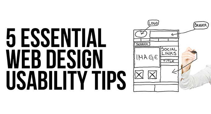
Five Essential Web Design Usability Tips
Web Usability is a clunky phrase meaning ‘ease of use’ of a website. Get it right and your website will encourage brand loyalty and trust by giving visitors an experience that makes them feel smart and in control. Get it wrong and that trust will evaporate as they struggle with a frustrating website that brings on feelings of incompetence. Here are five usability tips to consider.
1. Build in Usability From the Start
Imagine you are one of your own customers visiting the website for the first time. What are you looking for? It might be something very straightforward like the opening times of your shop or a contact phone number, or it might be something more involved such as placing an online order. Draw up a check-list of the information you want your customers to access quickly and easily from your website. Usability starts with understanding your target audience – always bear them in mind while designing your website.
2. Surface Simplicity
Straightforward links and clear pathways to key content on your website will enable the visitor to feel in control. Don’t try to be clever – follow the accepted conventions, such as using blue for text links – if your visitors become lost and disorientated, they won’t stick around. As luck would have it, the vast majority of visitors to your website will already be adept at tracking down the information they need. Eye tracking studies show that users browse content in seconds, scanning the site for useful links to click. The downside of this predictable search pattern is that the slightest hitch or frustration could well push potential customers into clicking away from your website.
3. Mobile Optimisation
With the introduction of Google’s mobile friendly search tags, optimising your website for smartphones and tablets has become a no-brainer. Bear in mind that mobile devices rely on touch-targets rather than mouse clicks. Small, tightly packed touch-targets are the cause of accidental clicks and can be hugely irritating. Large, well spaced targets will make life easier for your customers. Try Google’s quick and easy Mobile Friendly Test to find out if your website makes the grade.
4. Cut Out the Curses
We’ve all been there: Swarms of blinking images, links that look promising but take you on a wild goose chase, unreadable text against a funky background, annoying pop-ups… all guaranteed to raise the hackles and drive customers away. And if you think all that razzmatazz is a sure-fire way of grabbing attention, think again. Regular internet users quickly develop banner blindness, a skill that helps them filter out the noise from visual clutter and enables them to focus on what is important.
5. Test Early, Test Often.
Finally, make sure you test your site on different devices and different browsers – it may all work fine on your machine, but that doesn’t mean it will work for everyone. Getting valuable feedback from potential customers will give you a chance to put things right, so it is important to start testing early in the development stage and at regular intervals right through to launch.
