Meet Cracked Johnnie. He’s a bit of an animal, wild and anarchic. And here’s Moonbeam, soft and gentle with a hint of quiet sophistication. Then there’s Little Lord Fontleroy, fancy and high falutin’ just as you’d expect.
The Fonts You Choose are like the Company You Keep.
Fonts really are like people, they each have their own individual style and spirit. So, Cracked Johnnie would go down a storm at your upcoming mad bash, but you probably wouldn’t want him around when you’re dining with your in-laws. Try leaving Little Lord Fontleroy at the local high school, and he’d be having his head flushed in the toilet during the very first break time.
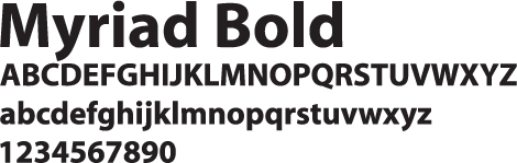
There are more than 100,000 fonts to choose from – this gives you a massive amount of artistic freedom, but such a dizzying multitude can soon send you screwball. When it comes to selecting a particular font, it’s worth putting some thought into the impression you want to make on your target audience. For example, the professional networking site LinkedIn has based its logo on the very business-like, no nonsense font Myriad Bold, whereas the Twitter logo is based on the fun and friendly Pico Alphabet.
It might also help to think about fonts as belonging to different families. So for a nostalgic feel, you could choose a font from the Retro family; for an edgy mood, go for a Graffiti font, and if you want a combative flavour, try an Military font.
How Your Font Could be a Tattle-Tale
In the same way that some companies hire a graphologist to analyse handwriting to determine the personality and character traits of the writer, it is now likely that your choice of fonts will also come under scrutiny. Most word processing applications have a super safe go-to font such as Times New Roman or Arial, but what message are you giving if you stick with such a font? You may feel that it gives a dependable air of integrity, on the other hand it could give the impression that you are boring, stuffy and timid. Oh, and a word about Cambria, the post-2007 Microsoft go-to font. Stick with Cambria and you’re telling the world that you are oblivious to the whole concept of font selection and you are simply hostage to the default.
Cracked Johnnie on your CV will send a very definite message about you to your potential employer, just as a obituary in Comic Sans is not likely to go down well with the bereaved. There is a time and a place for unbridled creativity, you also need to know when it’s best to rein it in and tone things down.
Get to Know Your Fonts
With so many fonts out there, it’s no wonder that choice of font has become a whole art form in its own right. Try getting to know your fonts – test them out, see how they behave, give them space to play, be adventurous. Go on, have a blast!