Using Colours In Logo Design
The psychology of colour in branding and logo design is a fascinating subject to explore. Colour can be used as a powerful tool to influence our thoughts and emotions at an unconscious level, so it’s little wonder that theory of colour provokes so much discussion and controversy. A cursory internet search reveals a rainbow of diagrams and infographics with advice such as: Red conveys power and passion, green is soothing, yellow is cheery – but is that all there is to it?
Take a look at how these famous brands have made the colours work in for them.
Cadbury’s Purple
The colour purple is associated with sophistication and luxury. Confectionery giant Cadbury has used its rich and distinctive shade of purple in its packaging for a hundred years. Cadbury’s purple, technically known as Pantone 2865c, became something of a cause celebre when Cadbury took to the law to register it as a colour trade mark. If allowed, this would protect the brand by preventing competitors within the same market sector from fooling customers with confusing lookalikes. In an epic ten year legal tug-of-war with Nestle, the two giants battled it out. Cadbury was eventually forced to concede defeat in 2014, but the fight for Pantone 2865c might yet reignite.
Subverting the Colour Pink
Most colour infographics will tell you that pink is a feminine colour which elicits feelings of softness and innocence. But in a stroke of branding genius, the Sex Pistols twisted the sweet nature of pink into an aggressive, in-your-face blast. Subverting pink in this way, and combining it with a fierce, primary yellow brings on an intense discordance that is every inch Sex Pistols.
.jpg)
The Colours of Fast Food
Check out the logos of many fast food chains and you’ll notice a common theme in the choice of colours: a combination of brilliant red and glowing yellow. It might seem obvious that these are exciting, attention grabbing colours, but it is also claimed that they can trigger appetite and encourage a sense of urgency. This not only gets customers in the mood for fast food fare, but it also makes them more likely to eat quickly. It goes right to the core of the fast food restaurant model – to get customers through the door and speedily satisfy their cravings so that customer throughput is kept to the max.
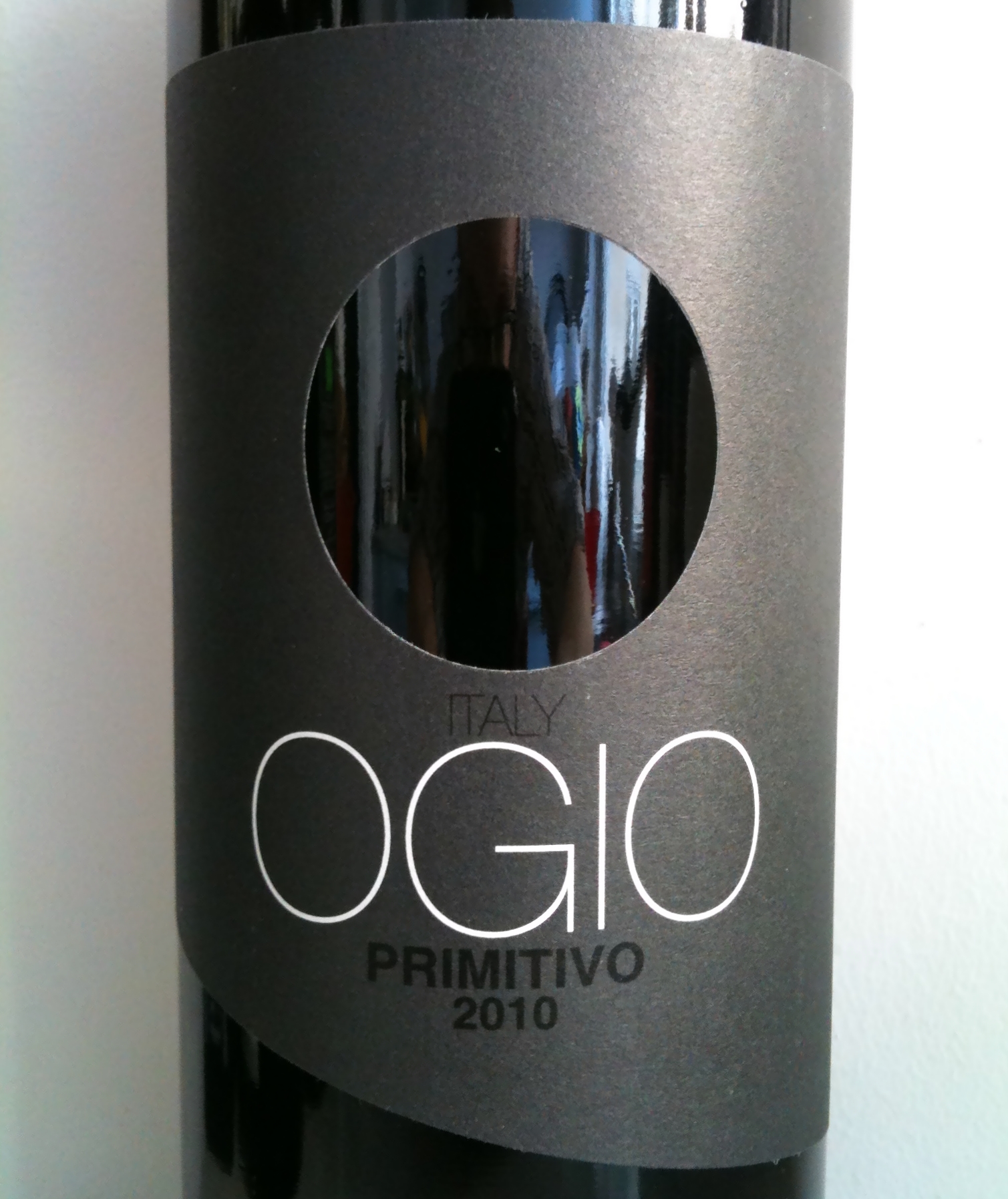
The No-Colour Logo that Grabs Attention
The expression ‘less is more’ is bandied about a lot in the world of logo design. Ogio wine has taken this principle to the extreme with its sleek, slate grey brand colour and perfectly circular hole taking the place of an image. With absolutely no distracting details or extraneous information, Ogio’s supercool branding makes the bottle stand out on the supermarket shelf, drawing the eye of customers away from its competitors. It really works!
It is clear that the effects if colour in branding and logo design can be complex and surprising. Get it right and the colours you choose will catch the eye, resonate with your target audience and convey deeper meaning about your brand.