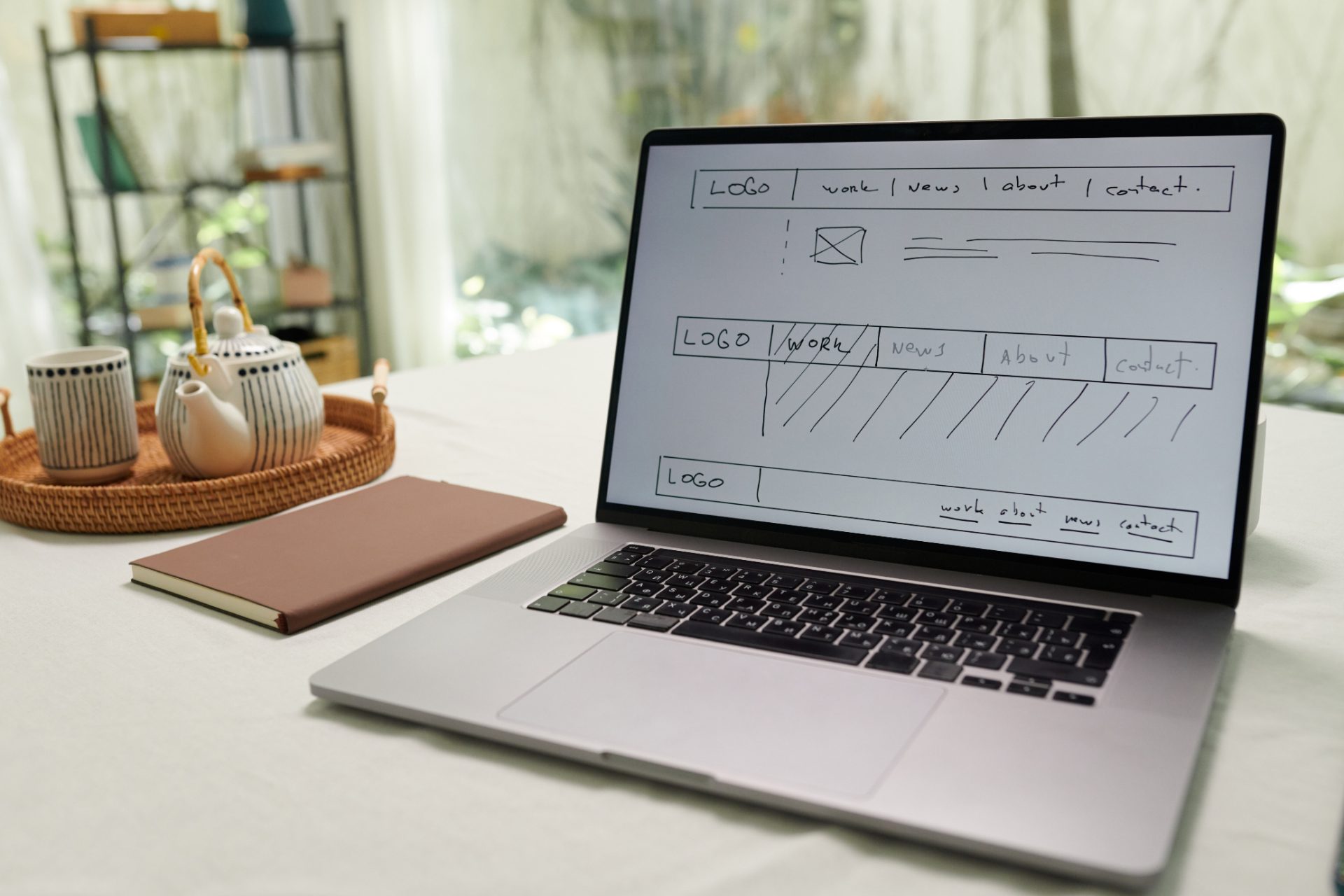
How Much Does a Website Cost in Ireland? What to Expect to Pay a Web Designer
A bespoke business website from Design Minds costs between €5,000 and €15,000. That range covers most Irish SMEs, from a well-built brochure site to a larger build with online sales. Below is what moves a project within that range, what is included as standard, what it costs to run afterwards, and what you own when it is finished.
What decides whether a site costs €5,000 or €15,000?
Six things, mainly:
- Number of pages. A ten-page site and a fifty-page site are different jobs.
- Custom design. We build bespoke sites, not templates. Every page is designed for your business, and the more distinct page types you need, the more design there is.
- E-commerce. Online sales add products, payments, shipping and a lot of testing.
- Copywriting. If we write the words as well as design the pages, that is costed in.
- Photography. Original photography lifts a site; stock imagery is cheaper but everyone can tell.
- Animation and motion. Video headers, animated elements and interactive features take time to build well.
Every site we build includes a WordPress platform, a fully mobile-responsive design, on-page SEO set-up, contact forms, training on how to update it yourself and advice on hosting. Those are not extras. See our website design and build service for more.
How long does a website take, and what holds it up?
A typical site takes four to six weeks from signed proposal to launch. The one thing that delays almost every project is content from the client — copy, images, staff photos, product details. If you want to keep to the timeline, gather your content before we start, or ask us to produce it.
Starting with the brand helps too. Many of our websites are the second job after a logo or identity, and when the brand is already defined the build is faster and the result more coherent. A website should start with your brand, not a template.
What does a website cost to run each year?
Hosting is typically around €500 a year. Maintenance — plugin updates, security, backups and small changes — can be billed yearly or monthly to suit your budget. Whichever you choose, we are a phone call or an email away, seven days a week, if something needs fixing.
And once the site is paid for, it is yours. The domain, the hosting account and the full WordPress login belong to you. You are never locked in.
Who have we built for?
Recent work includes MKF Property Services, iCare Housing and Peter McVerry Trust — organisations with very different audiences, each with a site designed from their brand outward.
Where to start
If you are planning a new site or replacing one that is not working hard enough, send us your current web address and we will give you an honest opinion, with no obligation. Fill in the quote form, email info@designminds.ie or ring +353 (0)1 96 100 34.
Design Minds is an award-winning branding and design agency based in Dublin, with over 35 years' experience in logo design, brand identity, brochure design and website design and build for Irish businesses.

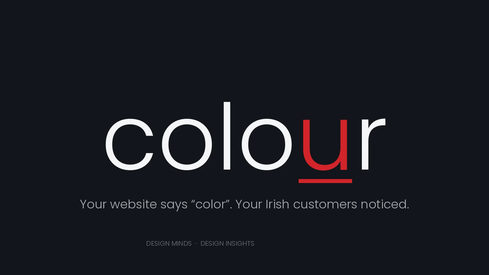
Your website says “color”. Your Irish customers noticed.
Not consciously, most of them. Nobody abandons a quote form over a missing u. But it registers somewhere below the level of attention, in the same place that notices a shopfront sign starting to peel: a small signal that this business is not quite from here, or not quite paying attention.
For an Irish company selling to Irish customers, that is a strange thing to be signalling by accident.
It is almost never the writer
Here is the part most people get wrong. Americanisms on Irish websites are rarely typed by anyone. They arrive in the furniture.
A standard WordPress installation defaults to US English. Themes ship with US strings. Plugins ship with US strings. Your cookie banner, your search placeholder, your form validation messages, your checkout flow — all written by developers who were not thinking about Malahide.
We checked our own site while writing this. The copy was clean. But the consent plugin had been quietly printing “Privacy Preference Center” on every page of designminds.ie, and it had never once occurred to us to look, because we had only ever proofread the words we wrote ourselves. It is fixed now.
That is the lesson. Proofreading your copy is not the same as proofreading your website.
Where to look
Run through these before you worry about your prose:
- Cookie and consent banners. The single most common offender, and it appears on every page.
- Form labels and error messages. “Enter your zip code” on an Irish contact form is a small disaster.
- E-commerce flows. Checkout, shipping, order confirmation emails.
- Search placeholders and 404 pages. Nobody proofreads a 404 page.
- Automated email templates. Sent thousands of times, read by everyone, checked by nobody.
- Anything drafted with AI. Large language models default to American conventions unless told otherwise, and they are confident about it.
It is more than spelling
Spelling is the visible part. The conventions underneath it matter more.
- Dates. 03/04/2026 means the third of April here and the fourth of March in the United States. On a booking form or a delivery date, that is not a style question.
- Eircodes. Seven characters, a three-character routing key, then a space. A field labelled “ZIP” that rejects a space is a field that rejects Irish addresses.
- Phone numbers. +353 1 961 0034, with the leading zero dropped after the country code. Validation built for ten-digit US numbers fails on Irish ones.
- Floors. Our ground floor is the American first floor. Worth knowing before you print signage.
- Currency. The euro symbol goes before the figure: €1,200.
Where it actually costs money
Two places, in our experience.
Public sector and B2B tenders. Procurement documents in Ireland are written in Irish English. A submission that comes back in American English reads as a template that has been pointed at Ireland rather than written for it — and when you are being scored against firms that got the small things right, you do not want to be explaining the small things.
Trust in considered purchases. Nobody checks spelling before buying a coffee. People do read carefully before appointing a contractor, choosing a solicitor, or committing to a five-figure supplier. That is precisely where the friction lands.
The fix is smaller than you think
Set your site language to English (Ireland). Add a house style note — -ise not -ize, colour, centre, organise, programme — and give it to everyone who touches the site, including your developer. Then walk your own site as a customer would: fill in the form, trigger the error, reach the 404, complete a purchase, read the confirmation email.
You will find something. We did.
One last thing worth saying plainly: this is a copy and localisation job, not a rebrand. Changing spelling conventions does not require a new identity, and any agency telling you otherwise is selling you a bigger project than you need.

Website Design and Build: Why Your Site Should Start With Your Brand, Not a Template
What Does Website Design and Build Actually Involve?
A proper website design and build project starts with the business, not the code. At Design Minds, that means understanding your sector, your customers and your goals before a single page is planned — then building on WordPress with clean, maintainable code that a small Dublin studio can support for years, not months. Good structure, sensible plugins and a clear content plan matter more than any passing trend.
Why an Off-the-Shelf Template Never Quite Fits
Templates are quick, but they're built for nobody in particular. A site that could belong to any business rarely convinces the right one to enquire. Custom website design and build for Dublin and Irish businesses means every page reflects how you actually work: clear navigation, fast load times, mobile-first layouts, and content built around what your customers actually search for — not what a theme demo happened to include.
One Studio, One Brand — Website and Print Together
The strongest sites we build share a designer with the brochure, the signage and the logo. That's deliberate: a visitor should recognise your brand instantly, whether they meet it in a browser or in print. It's why Irish SMEs come to Design Minds for a new website alongside their wider brand identity, rather than treating the two as separate jobs.
Thinking about a new site, or a rebuild that finally does your brand justice? Get in touch or email us at info@designminds.ie — we'd love to hear about your project.
Just How Mobile Friendly Is Your Website?
Towards the end of 2014, there was a flurry of excitement on the blogosphere when Google announced the launch of its Mobile-Friendly Test Tool. True to form, Google has made the test tool a doddle to use: simply type in your URL and the GoogleBot will analyse the site and let you know if your website has a mobile-friendly design. If your site get the thumbs up, then woohoo! Not only will you earn one of Google’s mobile-friendly tags but there are hints that Google is planning to give mobile-friendly sites more weight within its ranking algorithm providing a welcome boost for your site.
What if Your Site Fails?
If your website fails the test, don’t despair. The GoogleBot analyser generates a mini-report which looks something like this. Here are four of the most common problems picked up by the GoogleBot Mobile-Friendly Test.

Text Too Small
Many smartphones have a screen the size of a playing card, so pay a thought to how your customers will read the text on your site without getting eye strain. It’s surprising how many websites have this problem, but luckily it’s an easy one to fix. Google has provided guidelines about legible font sizes – the recommendation is a base font size of 16 CSS pixels.
Links Too Small and Close Together
Mobile devices rely upon tap targets rather than mouse clicks. Small and tightly packed targets are a huge source of irritation to customers with clumsy fingers who jab at the screen, accidentally tapping links they have no intention of opening. Bear in mind that the average adult finger pad is reckoned to be around 10mm wide, and Google recommends a tap-target of at least 7mm. To find out more about how to fix the problem and pass the GoogleBot mobile-friendly test, visit the advice page on how to Size Tap Targets Appropriately.
Mobile Viewport Not Set
If your webpage looks fine on your desktop, but all screwy on a mobile, it is likely that there is a problem with the viewport. This controls the width and scale of a webpage on different devices, so it is very important to make sure that it is configured. If you’ve never heard of a viewport before, Google provides an excellent explanation on its guidance page Configure the Viewport.
Content Wider Than Screen
The GoogleBot Test Tool checks to make sure that users don’t have scroll sideways or zoom to view the content on your site.Visitors to your website are unlikely to bother with content that falls outside the edge of the screen, so the advice from Google is clear: Make it Responsive.
The Way Forward: Responsive Web Design
To fix the problems and create a flexible layout to suit all screen sizes on a range of devices from a smartphone to a mega-screen TV, Google recommends using Responsive Web Design (RWD). This may sound like a daunting challenge, so if the task is beyond your capabilities it’s worth seeking advice from a professional designer.
Don’t miss out: deliver a mobile-friendly website your customers will return to time and again.
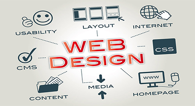
Five Simple Tips For A Successful Website
How do your customers find you? Chances are, their first port of call will be your website. This gives you the perfect opportunity to connect with your customers by designing a website they will enjoy. Here are five simple tips to help you on your way.
1. Make it Central to your Branding Strategy
Take a look at these two sites: Vogue and TeenVogue. You’ll see immediately that they have been branded differently to appeal to two distinct groups of customer. It’s important to design your site to attract your target audience, but there are a few basic principles to follow when it comes to the overall organisation and appearance of your website.
Start with your logo: It should be given a prominent position and appear in the same header spot on all your pages. A high resolution image that links to your homepage will help customers get to know your logo and easily navigate your site.
Next, pay attention to the colour scheme and font choice as these will set the tone and character of your website. Consistency is the key. Customers will get to know you through your branding, so once you have a found a style that works, make sure you stick to it for all your web pages.
2. Include the Essentials
This is a really simple thing to get right, but it is so often overlooked. Compile a list all the things you want your customers to find easily from your website: for example your contact details, opening times and how to place an order. Ask around your employees and customers to find out what they think – you might be surprised by what they consider to be must-haves on your site. Make your navigation and links prominent and intuitive. If visitors to your website feel at ease and in control, you can be confident that your website is working for you to establish customer trust and brand loyalty.
3. Use Quality Content
Just as blinking images and visual overload can make users click away, so too can being faced with a solid wall of badly organised text. Focus on the information that you want your target audience to absorb and consider how the text appears on the screen – is it visually inviting? Adding fresh content to your site can be a great way to keep visitors returning, but make sure you keep eye-strain to a minimum.
4. Cut out the Clutter
Bells and whistles are out, sleek elegance and simplicity is in. The demise of Adobe Flash, aided along by the Occupy Flash movement, has helped turn the tide against excessive visual bling. So, give your content breathing space, and keep to a standard layout.
and finally…
5. Make it Responsive
This tip might seem not-so-simple, but the ever accelerating trend towards mobile technology means that your website must seamlessly adapt to any device and any screen size. The way forward is to build your site using Responsive Web Design (RWD). If you feel that building your own site is beyond your capability, get help from the experts: Invest in a professional web designer.
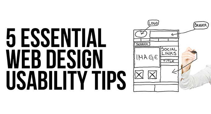
Five Essential Web Design Usability Tips
Web Usability is a clunky phrase meaning ‘ease of use’ of a website. Get it right and your website will encourage brand loyalty and trust by giving visitors an experience that makes them feel smart and in control. Get it wrong and that trust will evaporate as they struggle with a frustrating website that brings on feelings of incompetence. Here are five usability tips to consider.
1. Build in Usability From the Start
Imagine you are one of your own customers visiting the website for the first time. What are you looking for? It might be something very straightforward like the opening times of your shop or a contact phone number, or it might be something more involved such as placing an online order. Draw up a check-list of the information you want your customers to access quickly and easily from your website. Usability starts with understanding your target audience – always bear them in mind while designing your website.
2. Surface Simplicity
Straightforward links and clear pathways to key content on your website will enable the visitor to feel in control. Don’t try to be clever – follow the accepted conventions, such as using blue for text links – if your visitors become lost and disorientated, they won’t stick around. As luck would have it, the vast majority of visitors to your website will already be adept at tracking down the information they need. Eye tracking studies show that users browse content in seconds, scanning the site for useful links to click. The downside of this predictable search pattern is that the slightest hitch or frustration could well push potential customers into clicking away from your website.
3. Mobile Optimisation
With the introduction of Google’s mobile friendly search tags, optimising your website for smartphones and tablets has become a no-brainer. Bear in mind that mobile devices rely on touch-targets rather than mouse clicks. Small, tightly packed touch-targets are the cause of accidental clicks and can be hugely irritating. Large, well spaced targets will make life easier for your customers. Try Google’s quick and easy Mobile Friendly Test to find out if your website makes the grade.
4. Cut Out the Curses
We’ve all been there: Swarms of blinking images, links that look promising but take you on a wild goose chase, unreadable text against a funky background, annoying pop-ups… all guaranteed to raise the hackles and drive customers away. And if you think all that razzmatazz is a sure-fire way of grabbing attention, think again. Regular internet users quickly develop banner blindness, a skill that helps them filter out the noise from visual clutter and enables them to focus on what is important.
5. Test Early, Test Often.
Finally, make sure you test your site on different devices and different browsers – it may all work fine on your machine, but that doesn’t mean it will work for everyone. Getting valuable feedback from potential customers will give you a chance to put things right, so it is important to start testing early in the development stage and at regular intervals right through to launch.

Putting Personality Into Your Business With Social Media
Are you a social media skeptic? Find yourself shuddering at the mere mention of Facebook or Twitter? You’re not alone. But whether you are a new start-up or a well established business, there is no escaping the fact that social media has become a vitally important tool for reaching customers. On the plus side, the mushrooming of social media sites means there is bound to be the right platform for you.
Here are five examples of how companies and organisations have found creative ways to promote themselves and connect with customers through social media.
1. Find the Right Platform
There are hundreds of social media sites out there, and each platform has its own personality and appeal. The top 15 most popular sites will give you some idea of what’s available, but you don’t have to stick to these. Take your time to research them and choose the ones that are likely to suit you and your business.
For example, the Natural History Museum, London has crafted its Pinterest site to develop a sense of community between visitors of all ages and backgrounds, encouraging them to explore and learn together.
2. Target Different Audiences
Video sharing networks are becoming increasingly popular, with sites such as Vine and Vimeo providing alternatives to YouTube. Vine and Vimeo are branded differently, and can be used to reach different target audiences, as you’ll see from the Marmite example. Marmite on Vine shows playful, six second looping clips of Marmite in various situations – such as one in which a menacing Marmite gang sees off a jar of Vegemite. The Marmite Channel on Vimeo has a more grown-up feel, encouraging customers to share their own videos of their Marmite experiences. Love it or hate it, the debate goes on.
3. Connect With Your Customers
WD40 is an iconic brand with a hugely popular and long running marketing campaign which challenges customers to find new uses for the oil in a spraycan – over 2000 suggestions have so far been put forward. The WD40 Pinterest page has given new energy to the campaign which looks set to run and run.
4. Hit the Right Tone
Audi on Google+ has made a lovely job of showcasing the Audi brand, and the platform encourages customers to interact and get them talking. You might think that you already know your customers and what they want, but social media is a two-way street providing you with a golden opportunity to learn so much more.
5.Encourage Lively Banter, but Watch out for Trolls
Trolls and baiters are a fact of life on social media, but learn to deal with them effectively and you could even turn the situation to your advantage. In 2012, angry O2 customers took to Twitter to vent their frustration about a service failure. The O2 Twitter team tackled the crisis head on, responding to even the most offensive tweets with robust humour and personality. But be warned! This high risk approach can easily backfire. Dealing with trolls requires a great deal of skill, experience and social media savvy: The general rule is Don’t Feed the Trolls.