Weaking Logos: Small Changes That Worked (And Some That Didn’t)
Whenever a large corporation makes even the tiniest of tweaks to its logo, there’s one thing you can guarantee – it won’t go unnoticed. There is an army of eagle-eyed logo spotters out there, poised to pounce, scrutinise and pronounce judgement. Here are five logo changes and the reactions they have provoked from the logo watchers.
Agghh! Change it Back!
To mark its transition from American chocolate maker to global confectionery giant, Hershey’s announced with great fanfare the unveiling of a new logo. From printed material and websites to the design of offices and shops, this new “visual identity system” would be rolled out all the way. At first glance the changes to the logo aren’t all that earth shattering – “Hershey’s” shortened to “Hershey” and a modern flat-design makeover – but it is the updated Kisses emblem that really catches the eye. Stripped of its enticing silver wrapper and pared down to a simple, flat shape, the new symbol bears a striking resemblance to a certain unpleasant emoji. Verdict from logo watchers? Eww!
Small Change, Big Difference
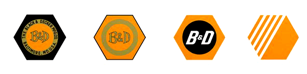
Big news: Black and Decker has lost its nut. This iconic brand image, familiar to DIYers for nearly 100 years, has been dropped. Along with the nut, the robust ampersand has also gone, to be replaced by an awkward looking + sign. Each individual change might not seem much, but the overall effect is huge. Online reaction to the Black and Decker logo has not been kind – vanilla, generic, weak and cheap. Oh dear.
No Flocking the Bird
In 2012 the top brass at Twitter made an announcement: No longer did they see a place for text in their logo. Henceforth the bird alone would stand as the universal symbol of Twitter. In a game of spot the difference, logo watchers pinpointed the most significant change to the Twitter bird: Its punk hairdo had been given the chop. Along with the new bird came a string of ‘usage guidelines’, including ‘don’t flock the bird with other birds’ and ‘don’t anthropomorphize the bird’. This provoked the headline Twitter goes Trademark Crazy from New Statesman, who then immediately set out to break the rules by publishing a picture of the Twitter bird on a skateboard.
Panda Express
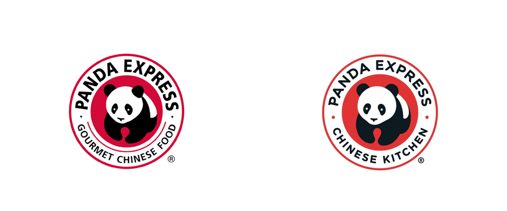
A familiar sight in the shopping malls and airport food courts of the United States, fast-food chain Panda Express recently gave its logo a little tweak. The distinctive panda symbol remains unchanged, but a softer font, toned-down red and the change of wording from ‘Gourmet Chinese Food’ to ‘Chinese Kitchen’ has given a friendlier feel to the overall logo. Thumbs up for Panda Express from the logo watchers.
and finally…
Visa
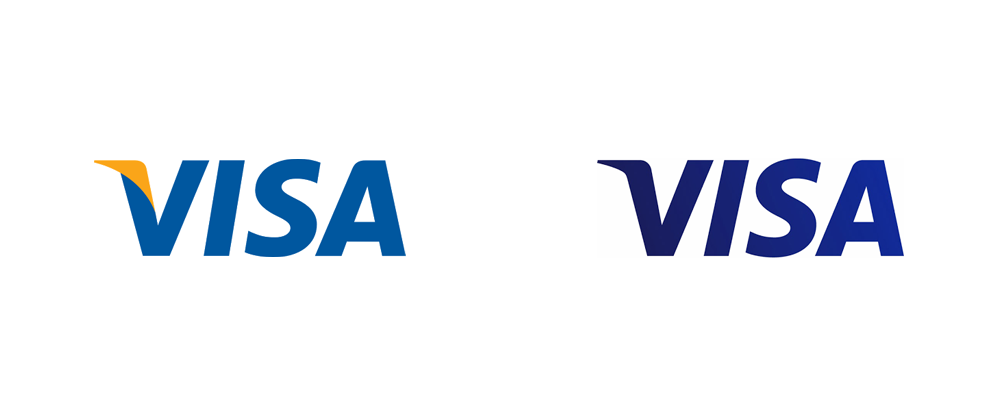
For over 55 years, Visa has enjoyed one of the most enduring and recognisable logos the world over. Throughout that time the font has remained constant and the colour scheme hardly altered, but every so often Visa refreshes the brand image with a slight shift in detail. The latest makeover sees Visa losing its yellow flick and turning a darker shade of blue with a subtle gradient. The verdict: Fine… but why?