Is Your Logo A Shirker Or A Worker?
Whether you know it or not, your logo is an intrinsic part of your workforce, a tireless ambassador for your brand. Or, at least, that’s how it ought to be. A well designed logo really can be a powerful asset to your business, pulling in your target customers and winning brand loyalty. To achieve this, your logo needs to look the part and give off all the right signals as it makes its way in the world.
A logo built on firm foundations will have genuine confidence and integrity that will set it ahead of the competition. Take a look at these examples of classic logos, and notice how they embody the character and spirit of their brand with strength and assurance.
JCB and CAT
Designed in 1953, the JCB logo is a familiar sight on JCB diggers, trucks and forklifts the world over. With its no-messing-around lettering and distinctive black and yellow colour scheme, the logo picks up the flavour of those warning hazard stripes that are frequently used around construction sites. If you take a look around at companies in a similar line of business, you’ll see a theme developing. The Caterpillar Company CAT goes for the same distinctive yellow and black colour scheme with its iconic CAT Triangle. This famous yellow triangle even brings in additional revenue of the company through merchandising, making it a nice little earner. JCB is also tuned in to this additional stream of revenue with the JCB Shop selling everything from JCB scale models to watches, hats and USB sticks.

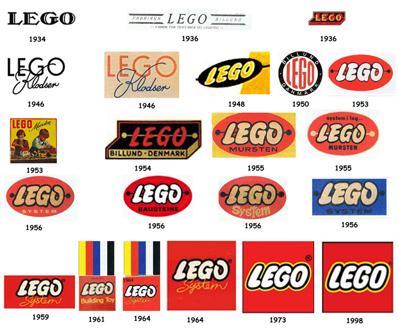
Lego
Generations of children have grown up with Lego, so it’s little wonder that Lego has the go-to logo when it comes to branding toys and games. Established in Denmark in 1932, the logo has evolved over the years into the simple, bright red and yellow friendly lettering we know today. The rounded, playful font choice has been part of the design since the 1950s, and has become a benchmark for branding products aimed at children. Other toy logos with the bright colours/bubbly font combination include Play-doh and Crayola.

WWF
Launched in 1961 this global charity has one of the most iconic and enduring logos of all time. The founders wanted a symbol to embody the plight of all endangered species driven close to extinction, and the Giant Panda was the perfect choice. All credit to conservationist Sir Peter Scott, who had both the vision and design skills to create the original logo. Apart from a few tweaks over the years, the WWF Panda is still going strong and attracting supporters to the cause.
Creating a successful logo that reflects the personality of your business takes skill, artistic flair and a sound understanding of the principles of logo design. Invest in a designer to create your own unique logo, and it will give you years of loyal service representing your company and promoting your brand.
![]()